Visualization Slide for Preference in Online Learning
RJ0500041_11
- Last Update 06/18/2025
- File Size 0.3MB
- # of Slides 2
- File Format PPTX
- Slide Ratio 16:9
- Color
Keywords
- #Content-Based Slides
- #Design-Based Slides
- #Market and Competitor Analysis
- #Marketing Plan and Strategy
- #Diagram
- #Graph
- #Competitive Advantage
- #Marketing Objectives
- #Cluster
- #Circles
- #Closed Cluster Diagram
- #Doughnut Chart
- #16:9
- #donut chart PowerPoint slide
- #pie chart template download
- #ratio comparison diagram
- #data visualization slides
- #how to create donut chart in PowerPoint
About the Product
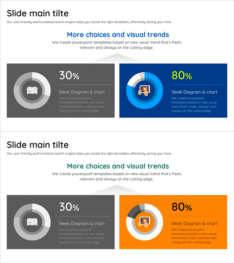
A two-slide PowerPoint presentation featuring donut-shaped pie charts for visualizing online learning preferences and market analysis data. The slides use gray, dark blue, and orange backgrounds with white and blue donut charts displaying 30% and 80% ratios respectively. Each slide includes a centered icon within the donut structure, making it ideal for comparing two data sets in marketing presentations, business reports, and educational materials. Fully editable in PPTX format with 16:9 widescreen aspect ratio.
Usage Points
-
Main Usage
Visualize and compare two different percentage ratios simultaneously using donut-shaped charts, ideal for presenting online learning preferences, market share data, and marketing strategy analysis. The centered icon area provides clear category differentiation and enhances visual impact.
-
How to Use
Replace the donut chart percentages (30%, 80%) with your own data values. Swap the centered icons with relevant images matching your presentation topic. Select the background color (gray, dark blue, or orange) that best fits your brand or presentation theme for visual consistency.
-
Recommended For
Marketing professionals, market research analysts, online education planners, and business strategy teams presenting preference surveys, market share comparisons, customer satisfaction metrics, and competitive analysis data.
-
Slide Structure
Two slides in 16:9 widescreen format (PPTX). Slide 1: Gray background with white and gray donut chart (30% ratio) and centered book icon. Slide 2: Dark blue background with blue and white donut chart (80% ratio) and centered user icon. Both slides are fully editable with customizable colors, text, and icons.
Related Products
-

SUV Percentage Donut Graph – Market Status Analysis
#Market and Competitor Analysis #Diagram #Graph
-

Stock Price Rise Analysis Donut Graph – Market Growth and Opportunities
#Market and Competitor Analysis #Diagram #Graph
-

User Experience Advantage Analysis Chart – Visualizing Competitive Edge
#Product/Service Introduction #Market and Competitor Analysis #Diagram
-

Cell Phone Development Status Analysis Chart – Competitive Advantage and Insights
#Product/Service Introduction #Market and Competitor Analysis #Diagram
