Area Graph Visualization – Simple and Effective Comparison
RJ0500039_17
- Last Update 06/17/2025
- File Size 1.2MB
- # of Slides 2
- File Format PPTX
- Slide Ratio 16:9
Keywords
About the Product
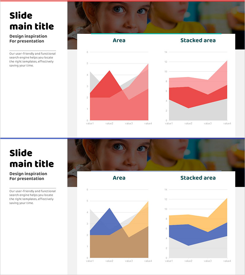
Area chart PowerPoint slides for effective data visualization with two distinct layouts. This presentation template features a standard area chart and a stacked area chart, enabling flexible comparison of multi-series data across different scenarios. The design uses gradient color schemes—red, pink, and gray tones in one layout, and blue, orange, and brown in the other—to enhance visual distinction. With four data points (value1 through value4) per chart, these slides effectively communicate both trend progression and compositional proportions in business presentations.
Usage Points
-
Main Usage
Designed to simultaneously visualize time-series data trends and component composition ratios. The standard area chart emphasizes absolute value progression of each series, while the stacked area chart clearly shows each item's contribution relative to the total.
-
How to Use
Ideal for financial reports analyzing revenue composition, marketing materials tracking channel performance trends, and business plans comparing quarterly targets. Edit the values and legends directly within the slides for immediate presentation use.
-
Recommended For
Finance teams, executives, marketing professionals, and project managers benefit from these slides when preparing periodic reports, analytical presentations, and strategy meeting materials. Particularly effective when comparing multi-series data across time periods.
-
Slide Structure
Two-slide set featuring a standard area chart on the first slide (four series, four data points) and a stacked area chart on the second (identical series and points). Optimized for 16:9 widescreen format.
Related Products
-

Visualizing Market Share with Plus Donut Chart
#Market and Competitor Analysis #Diagram #Graph
-

Line Charts for Design Tasks – Market and Competitor Analysis
#Market and Competitor Analysis #Graph #Future Outlook
-

Visualizing Work Progress Status by Job with Doughnut Chart
#Product/Service Introduction #Market and Competitor Analysis #Graph
-

User Analysis Graph by Age Group – Advanced Data Insights
#Market and Competitor Analysis #Diagram #Graph
