Asia Target Market Analysis Graph – Visualizing Market Strategy
RJ0400053_12
- Last Update 06/01/2025
- File Size 0.6MB
- # of Slides 2
- File Format PPTX
- Slide Ratio 16:9
- Color
Keywords
- #Content-Based Slides
- #Design-Based Slides
- #Market and Competitor Analysis
- #Marketing Plan and Strategy
- #Graph
- #Other
- #Target Market
- #Target Market Strategy
- #Column
- #Segmented Column
- #Map
- #Mockup
- #16:9
- #Asia map PowerPoint slide
- #market analysis graph template
- #vertical bar chart presentation
- #Asia market strategy slide
- #mockup slide design download
About the Product
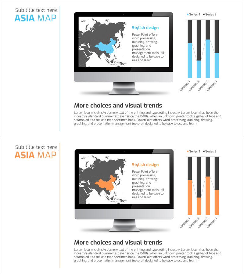
A 2-slide PowerPoint set visualizing Asia target markets with integrated map and bar chart design. The first slide displays an Asia map with highlighted key markets alongside a vertical bar graph comparing market size across four regions. The second slide uses the same layout with orange accent color to represent Series 2 data. This presentation template is ready to use for market strategy presentations, regional performance analysis, competitive positioning, and Asia-Pacific expansion planning. Created in 16:9 widescreen format with fully editable elements including map regions, graph values, and text fields.
Usage Points
-
Main Usage
Simultaneously display Asia regional market size and performance using map and bar graph visualization for intuitive regional comparison. Essential for investor presentations, market entry strategy briefings, and regional marketing plan development to enhance data credibility.
-
How to Use
On the first slide, modify the highlighted regions on the Asia map to indicate target markets, then input actual sales figures, market share, or growth rates into the adjacent vertical bar graph. Use the second slide to represent comparative data such as year-over-year performance, competitor benchmarks, or target projections.
-
Recommended For
Marketing managers, business development teams, investor relations (IR) professionals, international sales directors, and executives preparing market reports. Suitable for all business presentations addressing Asia market entry, expansion, or regional performance analysis.
-
Slide Structure
Both slides feature identical layout: left side Asia map with gray background and highlighted target countries in accent color, upper right title area, center right descriptive text, lower right vertical bar graph with 4 regional categories and 2 data series. Color differentiation: Slide 1 uses blue accents, Slide 2 uses orange accents for series comparison.
Related Products
-

Country-by-Country Analysis Comparison Chart – Market and Competitor Analysis
#Market and Competitor Analysis #Marketing Plan and Strategy #Graph
-

US Target Market Analysis Map
#Market and Competitor Analysis #Marketing Plan and Strategy #Other
-

Analysis of Key Target Markets in the United States – Developing Effective Marketing Strategies
#Market and Competitor Analysis #Marketing Plan and Strategy #Other
-

Target Country Market Share Map Graph – Insights for Market Analysis
#Market and Competitor Analysis #Marketing Plan and Strategy #Graph
