Trend of Line Charts by Year – Data Visualization and Strategy
RJ0500036_29
- Last Update 06/16/2025
- File Size 0.5MB
- # of Slides 2
- File Format PPTX
- Slide Ratio 16:9
- Color
Keywords
About the Product
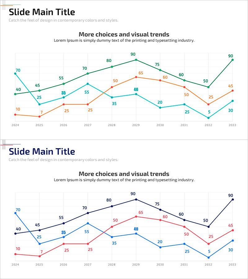
A professional multi-series line chart PowerPoint slide that clearly displays year-over-year data trends from 2024 to 2033. This 2-slide set features three data series represented in teal, orange, and blue color schemes on the first slide, with an alternative black, red, and blue combination on the second slide. Each slide presents the same data structure with different color palettes, allowing you to select the version that best matches your presentation background and theme. The line chart is optimized for trend analysis, growth rate comparisons, and market performance visualization, with data point labels ensuring precise information delivery. Designed in 16:9 widescreen format for seamless integration into modern presentation environments.
Usage Points
-
Main Usage
The primary goal is to visualize multiple data trends over time with clarity and precision. Three distinct line series enable simultaneous comparison of different metrics, while data point labels provide accurate numerical information. Ideal for business performance reports, quarterly earnings presentations, market analysis, and strategic decision-making materials.
-
How to Use
Insert these slides into executive reports, quarterly performance presentations, or market analysis decks within the data visualization section. Choose Slide 1 with teal, orange, and blue series for light backgrounds, or Slide 2 with black, red, and blue series for darker themes. Simply replace the sample data with your actual figures and update series labels to customize for immediate use.
-
Recommended For
Finance teams presenting quarterly performance metrics, marketing departments analyzing customer growth trends, sales teams comparing revenue targets versus actual results, and executives preparing strategic briefing materials. Particularly effective when comparing three or more indicators and emphasizing temporal change patterns.
-
Slide Structure
Each slide contains a title area, descriptive subtitle text, and a centered line chart. The chart features an 8-point X-axis (2024–2033), a numerical Y-axis range (0–100), three distinct line series, and data labels at each point. Grid lines and a legend support data interpretation and clarity.
Related Products
-

Modern Theme Bar Graph – Optimized Design for Market Analysis
#Market and Competitor Analysis #Graph #Market Analysis
-

Circular Graph for Big Data Analysis – Data Visualization
#Business Introduction #Technical Approach #Graph
-

Logistics Performance Comparison Chart – Market and Competitor Analysis
#Market and Competitor Analysis #Graph #Competitor Analysis
-

User Analysis Graph by Age Group – Advanced Data Insights
#Market and Competitor Analysis #Diagram #Graph
