Mixed Charts and Customer Analysis – Visualizing Customer Insights
RJ0500027_22
- Last Update 06/14/2025
- File Size 3.5MB
- # of Slides 2
- File Format PPTX
- Slide Ratio 16:9
- Color
Keywords
- #Content-Based Slides
- #Design-Based Slides
- #Market and Competitor Analysis
- #Financial Plans and Performance
- #Graph
- #Text Box
- #Other
- #Customer Analysis
- #Sales and Revenue
- #Rectangle Text Box
- #16:9
- #mixed chart PowerPoint slide
- #column line chart design
- #customer analysis chart template
- #market analysis PPT
- #financial performance visualization slide
About the Product
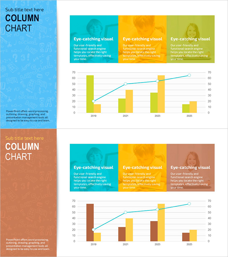
A mixed chart PowerPoint slide for visualizing customer analysis and market performance metrics. This presentation template combines teal, golden, and lime column charts with a teal line graph, enabling multi-data comparison at a glance. The left sidebar features three text sections for detailed explanations of each indicator. Optimized for year-over-year trends from 2019 to 2025, this PPT slide is ready for immediate use in financial performance reports, customer-based analysis presentations, and market trend discussions.
Usage Points
-
Main Usage
This mixed chart slide enables simultaneous comparison of multiple data series. Column charts represent absolute values while line graphs emphasize trends, providing clear quantitative evidence. Ideal for customer-based analysis, market share reports, and financial metrics presentations.
-
How to Use
Enter indicator descriptions in the three text boxes on the left sidebar and replace chart data with your actual figures. Suitable for year-over-year, quarterly, or monthly trend analysis. Can be applied to any presentation section requiring comparative data visualization.
-
Recommended For
Recommended for finance team performance reports, marketing team customer analysis, executive strategy presentations, investor relations materials, and market analysis reports. Essential for data-driven decision-making presentations.
-
Slide Structure
Two-slide set with each slide divided into a colored left sidebar (teal, golden, or lime) and right chart area. Top section contains three text explanation boxes; bottom section displays column charts (two series) and a line graph (one series) for clear information hierarchy.
Related Products
-

Bundled Vertical Bar Graph Blue Green – Market and Customer Analysis
#Market and Competitor Analysis #Financial Plans and Performance #Graph
-

Gender Analysis Chart – Ideal for Market & Customer Analysis
#Market and Competitor Analysis #Financial Plans and Performance #Graph
-

Coffee Consumption Survey by Gender – Visual Data Infographic
#Market and Competitor Analysis #Financial Plans and Performance #Diagram
-

Graphic Designer Demand Analysis Slide – Market Insights and Customer Statistics
#Market and Competitor Analysis #Graph #Other
