Animal Comparison with Pie Chart – Embracing Modern Sensibility
RJ0500026_25
- Last Update 06/14/2025
- File Size 0.6MB
- # of Slides 2
- File Format PPTX
- Slide Ratio 16:9
- Color
Keywords
About the Product
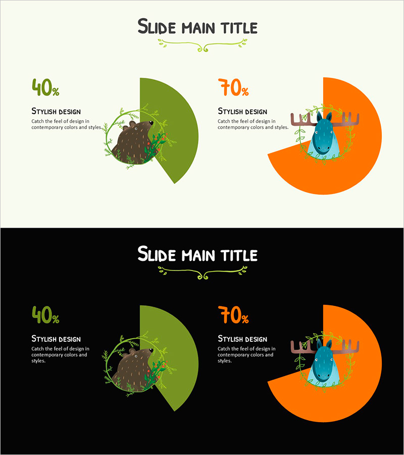
A PowerPoint slide template featuring two pie charts for comparing data ratios with animal illustrations. The design uses orange and green circular charts on light beige and black backgrounds, with text and percentage labels for clear data visualization. Includes 2 slides in 16:9 widescreen PPTX format. Perfect for educational presentations, marketing reports, and business analysis where ratio comparison is essential. All text, numbers, and illustrations are fully editable to match your presentation theme.
Usage Points
-
Main Usage
Designed to visually compare ratios, composition, and market share between two data categories. The combination of animal illustrations and numerical data enhances information clarity, making it ideal for educational, marketing, and business presentations requiring proportion analysis.
-
How to Use
Choose between the light background or black background version from the 2 included slides. Edit the pie chart percentages and labels to match your data. Replace animal illustrations with relevant icons or images representing your categories. Customize colors and text to align with your presentation branding.
-
Recommended For
Educational institutions presenting student demographics or gender distribution, marketing teams analyzing customer segments, business presentations comparing market share, environmental or biology-related topics requiring species ratio visualization. Suitable for educators, analysts, and business professionals.
-
Slide Structure
2-slide layout: Slide 1 features light beige background with orange (70%) and green (40%) pie charts plus animal illustrations; Slide 2 uses black background with identical layout. Each chart includes percentage values, labels, and text description areas in 16:9 widescreen format.
Related Products
-

Natural Environment Satisfaction Graph – Market and Customer Analysis
#Market and Competitor Analysis #Graph #Customer Analysis
-

Efficient Presentation Through Data Visualization – Modern Square Slide Design
#Company Introduction #Market and Competitor Analysis #Graph
-

Pie Chart and Chopa Illustration – Market Analysis Slide
#Market and Competitor Analysis #Financial Plans and Performance #Graph
-

Bundled Charts by Category – Market and Competitor Analysis
#Market and Competitor Analysis #Graph #Market Analysis
