Piano Icon Graph Slide – Data Visualization for Customer Analysis
RJ0500020_15
- Last Update 06/12/2025
- File Size 0.6MB
- # of Slides 2
- File Format PPTX
- Slide Ratio 16:9
- Color
Keywords
About the Product
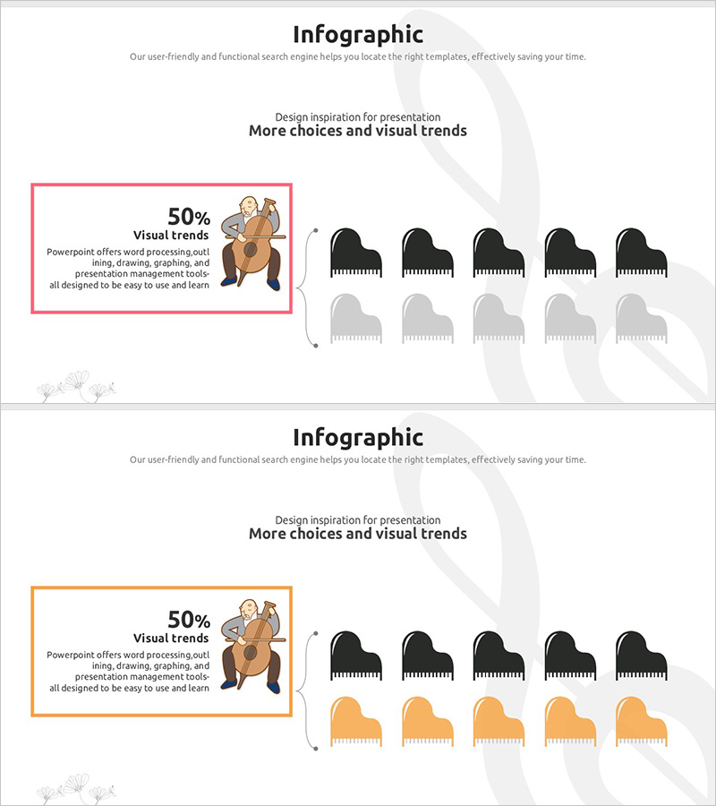
A PowerPoint slide set for customer analysis and market analysis with unique data visualization using piano icons. This 2-slide presentation features a distinctive graph design where piano icons represent 50% ratio data in an intuitive manner. The layout includes text areas highlighted with pink and orange borders on the left, paired with black and gray-toned piano icons arranged on the right. The 16:9 aspect ratio design is ready to use immediately in business presentations, marketing plans, and reports where you need to communicate comparative data such as customer preferences, market share, and trend analysis effectively.
Usage Points
-
Main Usage
Visualize comparative data for customer analysis, market research, and preference surveys using an icon-based graph approach. This slide is optimized for representing 50% ratio data with clearly separated text description and graph areas, enhancing audience comprehension and engagement.
-
How to Use
Enter your analysis topic and data description in the text box, then adjust the number of piano icons to represent your percentage ratio. Maintain the pink or orange border for brand consistency, and customize colors as needed for your presentation context. Use this slide in customer segmentation, market share, and trend comparison sections.
-
Recommended For
Ideal for marketing plans, market analysis reports, customer analysis presentations, and business plan market analysis sections. Recommended for marketing managers, planners, analysts, and sales executives presenting customer preference surveys or competitive analysis results.
-
Slide Structure
The 2-slide set features a consistent layout with a left text area (bordered in pink or orange) and a right graph area on each slide. The graph area displays 5 black piano icons and 5 gray piano icons representing a 50% ratio visualization. With 2 text input spaces and 1 data representation area per slide, the structure provides a simple yet clear information hierarchy.
Related Products
-

Gender Ratio Customer Analysis 3D Circle Graph – Insights for Market Understanding
#Market and Competitor Analysis #Graph #Other
-

Work Performance Analysis Graph – Visually Representing Employee Performance
#Market and Competitor Analysis #Graph #Other
-

Running Face Graph – Market Analysis and Technology Introduction
#Technical Approach #Market and Competitor Analysis #Graph
-

Customer Analysis Gender Ratio Analysis Graph - Key to Market Understanding
#Market and Competitor Analysis #Graph #Other
