Revenue Vertical Bar Chart – Innovation in Market Analysis
RJ0500016_15
- Last Update 06/11/2025
- File Size 0.2MB
- # of Slides 2
- File Format PPTX
- Slide Ratio 16:9
- Color
Keywords
- #Content-Based Slides
- #Design-Based Slides
- #Market and Competitor Analysis
- #Financial Plans and Performance
- #Graph
- #Market Analysis
- #Sales and Revenue
- #Column
- #Grouped Column
- #16:9
- #vertical bar chart PowerPoint
- #column chart slide template
- #revenue analysis graph
- #3-series bar chart
- #comparison data visualization PPT
About the Product
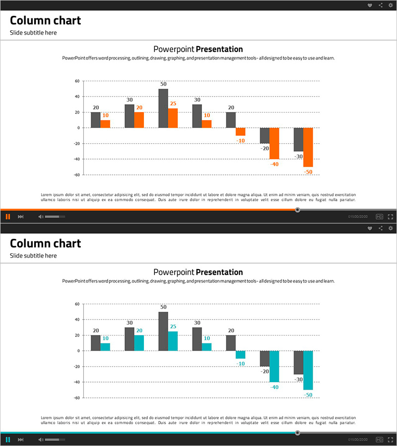
A 3-series vertical bar chart PowerPoint slide designed for revenue and market analysis presentations. The column chart features three data series in black, orange, and teal colors, enabling clear visual comparison of multiple data points. The 2-slide set includes templates for both positive and negative values, making it ideal for financial reports, sales analysis, performance reviews, and comparative data visualization. Fully editable in all PowerPoint versions with 16:9 widescreen format and PPTX compatibility.
Usage Points
-
Main Usage
Ideal for financial reports, sales analysis, and performance evaluations where multiple data categories need clear visual comparison. The three-color series (black, orange, teal) distinguishes data categories while the vertical column format emphasizes magnitude differences.
-
How to Use
Slide 1 is configured for positive-value comparisons, while Slide 2 handles mixed positive and negative data. Simply edit the data values and legend labels directly in PowerPoint to customize the chart for your specific presentation content.
-
Recommended For
Finance teams, marketing departments, and sales teams presenting quarterly or annual performance. Suitable for investor presentations, executive briefings, market analysis reports, and any data-driven business presentation requiring numerical comparison.
-
Slide Structure
2-slide set. Slide 1: 8-item × 3-series vertical bar chart (positive values). Slide 2: 8-item × 3-series vertical bar chart (mixed positive/negative values). Each slide includes title, subtitle, legend, and gridlines for professional presentation.
Related Products
-

Simple Car Wide Presentation Vertical Bar Chart
#Market and Competitor Analysis #Financial Plans and Performance #Graph
-

Animal Nature Conservation Program Facility Investment Plan Chart
#Market and Competitor Analysis #Financial Plans and Performance #Graph
-

Sales and Profit Table – Visualizing Financial Performance
#Market and Competitor Analysis #Financial Plans and Performance #Diagram
-

Visual Comparison by Product Group Slide Template – Market Trends and Performance
#Market and Competitor Analysis #Financial Plans and Performance #Graph
