Status Donut Chart Slide – A Powerful Tool for Data Analysis
RJ0500013_6
- Last Update 06/10/2025
- File Size 5.9MB
- # of Slides 2
- File Format PPTX
- Slide Ratio 16:9
- Color
Keywords
- #Content-Based Slides
- #Design-Based Slides
- #Product/Service Introduction
- #Market and Competitor Analysis
- #Graph
- #Development Status
- #Competitive Advantage
- #Circles
- #Doughnut Chart
- #16:9
- #donut chart PowerPoint
- #donut graph slide template
- #data ratio visualization
- #pie chart PPT
- #business data presentation slides
About the Product
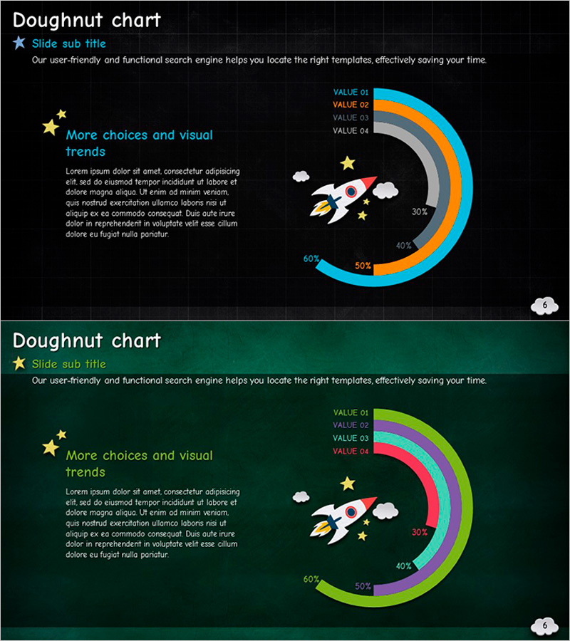
A professional donut chart PowerPoint slide set designed for business presentations and data analysis. This 2-slide PPTX template offers two color schemes—dark background and green background—each featuring a 4-series donut chart with percentage labels. Unlike pie charts, the center space allows you to add key messages, icons, or additional information, making it ideal for market share analysis, product composition breakdown, customer segmentation, and financial reporting. Decorative elements including rocket icons, stars, and clouds enhance visual appeal while maintaining data clarity. Each data series is color-coded and labeled with precise percentage values for immediate comprehension.
Usage Points
-
Main Usage
Donut charts excel at displaying proportional relationships between multiple categories relative to a whole. This slide set is optimized for presenting market share, product sales composition, customer demographics, budget allocation, and other multi-category data comparisons with visual clarity.
-
How to Use
Use the dark background slide for technology and IT-related presentations, and the green background slide for growth, sustainability, or financial topics. Simply edit the data series colors and percentage values to match your dataset, then insert your content into the center space for immediate deployment.
-
Recommended For
Marketing professionals, financial analysts, business executives, proposal writers, and academic presenters benefit from this template when communicating data-driven insights. Particularly effective for quarterly performance reports, market analysis, product portfolio overviews, and stakeholder briefings.
-
Slide Structure
Two-slide set, each featuring a 4-series donut chart with color-coded segments and percentage labels. The center area accommodates icons, text, or numerical highlights. Color palette includes blue, orange, gray, green, and pink series options, with supporting decorative elements positioned around the chart for visual balance.
Related Products
-

Development Status Analysis Donut Graph – Visualizing Competitive Advantage
#Product/Service Introduction #Market and Competitor Analysis #Graph
-

Ranking of Vegetables that Children Dislike – Fun and Engaging
#Product/Service Introduction #Market and Competitor Analysis #Diagram
-

Service Sector Development Status Graph – Visualizing Competitive Edge with Doughnut Chart
#Product/Service Introduction #Market and Competitor Analysis #Graph
-

User Experience Advantage Analysis Chart – Visualizing Competitive Edge
#Product/Service Introduction #Market and Competitor Analysis #Diagram
