Line Graph for Market Trend Analysis – Insights for Education
RJ0500012_12
- Last Update 06/10/2025
- File Size 0.4MB
- # of Slides 2
- File Format PPTX
- Slide Ratio 16:9
- Color
Keywords
About the Product
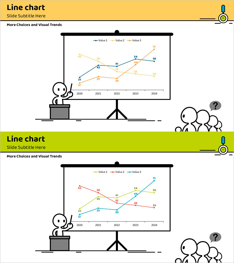
A multi-series line chart PowerPoint slide that visualizes five years of market trends (2020–2024) across three data series. Yellow, blue, and orange lines intersect and diverge to show comparative performance changes, with data point values clearly labeled for precise information delivery. The yellow header at the top and green footer band provide visual emphasis, while illustrated characters positioned on both sides create an engaging presentation atmosphere. The 2-slide template accommodates various data scenarios and is optimized for modern 16:9 widescreen presentations.
Usage Points
-
Main Usage
Compare annual or quarterly performance trends, competitive market share changes, and educational metrics such as enrollment growth, satisfaction scores, and achievement rates across multiple indicators over time. The intersection points and rising/falling segments of the three series highlight key turning points and dominant trends.
-
How to Use
Customize each series color to match your brand or comparison subjects, then replace data point values with actual statistics. Update the legend labels (Value 1, 2, 3) with meaningful category names and adjust the year axis to monthly, quarterly, or weekly intervals as needed. Modify the slide title and subtitle to match your presentation topic for immediate use.
-
Recommended For
Educational institutions presenting enrollment trends and academic improvement metrics, corporations analyzing quarterly revenue and customer satisfaction, marketing teams comparing campaign performance, consulting firms presenting industry trend analysis, and investment presentations explaining business growth trajectories.
-
Slide Structure
Both slides share identical layouts with three main sections: title area (yellow header), central graph area (3-series line chart with 2020–2024 timeline), and legend with axis labels. The Y-axis displays numerical scale on the left, final values on the right, and illustrated characters on both sides provide visual balance.
Related Products
-

Navigation App Market Trends and Outlook
#Market and Competitor Analysis #Graph #Future Outlook
-

Trend Analysis of Drug Response – Market and Competitor Analysis
#Market and Competitor Analysis #Graph #Future Outlook
-

Camera and Line Chart Comparison - Market Trends and Future Outlook
#Market and Competitor Analysis #Graph #Other
-

Market Trends and Competitor Analysis Chart – Emphasizing Future Outlook
#Market and Competitor Analysis #Graph #Future Outlook
