Science Component Comparison Slide – Effective Data Delivery Through Visual Comparison
RJ0500010_31
- Last Update 06/10/2025
- File Size 0.4MB
- # of Slides 2
- File Format PPTX
- Slide Ratio 16:9
- Color
Keywords
- #Content-Based Slides
- #Design-Based Slides
- #Operational Plan
- #Market and Competitor Analysis
- #Text Box
- #Organizational Structure and Staffing Plan
- #Competitor Analysis
- #Competitive Advantage
- #16:9
- #comparison analysis PowerPoint slide
- #two-panel contrast slide
- #competitive analysis PPT
- #comparison diagram slide
- #how to make a comparison slide in PowerPoint
About the Product
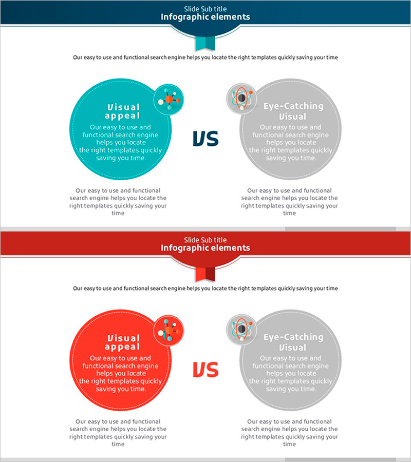
A 2-slide PowerPoint presentation template designed for side-by-side comparison of two elements. Features turquoise and red circular diagrams in a symmetrical left-right layout, with dedicated spaces for titles, descriptions, and icons in each section. Ideal for competitive analysis, product comparison, and concept contrast in business presentations. The clear text input areas and icon placeholders make it easy to establish information hierarchy, while the 16:9 widescreen format suits modern presentation standards. Perfect for emphasizing differences between two items or presenting alternative strategies.
Usage Points
-
Main Usage
Presents side-by-side comparison of two items, highlighting their characteristics, strengths, weaknesses, and differences. The symmetrical layout maximizes contrast effect, while turquoise and red color distinction provides visual clarity. Commonly used for competitive analysis, product positioning, concept comparison, and strategic decision-making presentations.
-
How to Use
Enter the first item's title, description, and icon in the left circular area, and the second item in the right area. Add overall context in the top text section and supporting details or conclusions at the bottom. Pre-positioned icon spaces maintain consistent layout while allowing quick data entry.
-
Recommended For
Executive reports, strategy meetings, investor presentations, and marketing planning sessions where competitive advantage and differentiation strategies need clear visualization. Recommended for product teams, marketing departments, strategy teams, and sales teams presenting competitive analysis or product positioning.
-
Slide Structure
Two-slide set with turquoise emphasis on the first slide and red emphasis on the second. Each slide includes one title area at top, two circular diagrams (left and right), two text areas within each circle, two icon spaces, and one description area at bottom, totaling nine input fields per slide.
Related Products
-

Soccer Match Silhouette – Market Analysis and Competitive Advantage
#Operational Plan #Market and Competitor Analysis #Text Box
-

Bar Chart Visualizing Freight Transport Trends – Essential Market Analysis Tool
#Market and Competitor Analysis #Graph #Text Box
-

Korean Traditional Culture Share Chart – Highlighting Cultural Excellence
#Operational Plan #Market and Competitor Analysis #Graph
-

Competitor Comparative Analysis Slide – Emphasizing Market and Competitiveness
#Market and Competitor Analysis #Graph #Text Box
