Column Segmentation Graph for Research – Visualization of Market Trends
RJ0500007_29
- Last Update 06/09/2025
- File Size 1.2MB
- # of Slides 2
- File Format PPTX
- Slide Ratio 16:9
- Color
Keywords
- #Content-Based Slides
- #Design-Based Slides
- #Market and Competitor Analysis
- #Marketing Plan and Strategy
- #Graph
- #Industry Trends
- #Target Market Strategy
- #Column
- #Segmented Column
- #16:9
- #100% stacked column chart
- #stacked bar graph PowerPoint
- #segmented chart template
- #market trend analysis slide
- #data visualization PowerPoint
About the Product
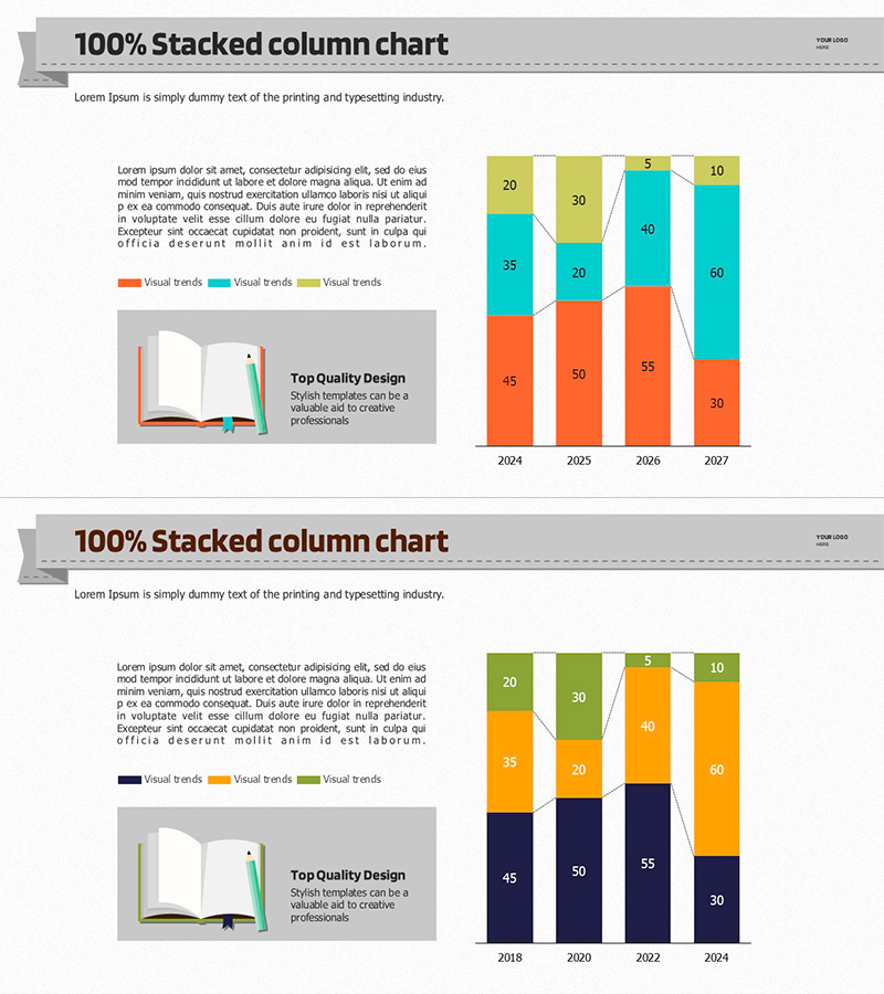
A 100% stacked column chart PowerPoint slide that visualizes market trends across four data series from 2024 to 2027. Each column is segmented into orange, cyan, lime, and beige sections with embedded numerical labels for easy data interpretation. This fully editable template is optimized for displaying proportional data such as market share distribution, product category sales mix, and customer segmentation analysis. The 16:9 widescreen format includes 2 ready-to-use slides with integrated text areas for contextual insights and professional presentation delivery.
Usage Points
-
Main Usage
Displays proportional composition of multiple data series across time periods or categories, enabling viewers to assess both individual segment trends and overall distribution changes simultaneously. Ideal for communicating market share evolution, product portfolio composition, and customer demographic shifts.
-
How to Use
Input numerical values into each colored segment of the stacked columns; the chart automatically calculates percentages to maintain 100% total. Use the legend to identify each series, add analytical commentary in the left text box, and present as a standalone data visualization or within a larger business report.
-
Recommended For
Marketing and sales reports, executive dashboards, competitive analysis presentations, business performance reviews, investor pitch decks, and strategic planning sessions. Best suited for marketing managers, sales directors, business analysts, management consultants, and financial professionals who need to communicate proportional trends.
-
Slide Structure
Each slide features a title header, left-aligned descriptive text box, and right-aligned 100% stacked column chart with 4 color-coded series across 4 time periods. Includes 4-item legend, data labels on each segment, and optional arrow callouts for emphasis. Both slides maintain consistent layout for multi-dataset comparison.
Related Products
-

Analysis Graph for Child – Market Trends
#Business Introduction #Market and Competitor Analysis #Graph
-

Four-Year Industrial Market Trends – Market Analysis and Decisions
#Market and Competitor Analysis #Financial Plans and Performance #Graph
-

Farm Subdivision Vertical Bar Graph – Market Trend Analysis
#Market and Competitor Analysis #Graph #Market Status
-

Marketing Plan and Strategy Segment Vertical Bar Graph – Blue and Yellow
#Market and Competitor Analysis #Graph #Industry Trends
