Academic-Related Male and Female Analysis Chart Map
RJ0500007_20
- Last Update 06/09/2025
- File Size 1.5MB
- # of Slides 2
- File Format PPTX
- Slide Ratio 16:9
- Color
Keywords
- #Content-Based Slides
- #Design-Based Slides
- #Market and Competitor Analysis
- #Marketing Plan and Strategy
- #Other
- #Customer Analysis
- #Target Setting
- #Map
- #16:9
- #map infographic PowerPoint
- #regional analysis slide
- #gender ratio comparison chart
- #how to create a map infographic in PowerPoint
- #demographic data visualization slide
About the Product
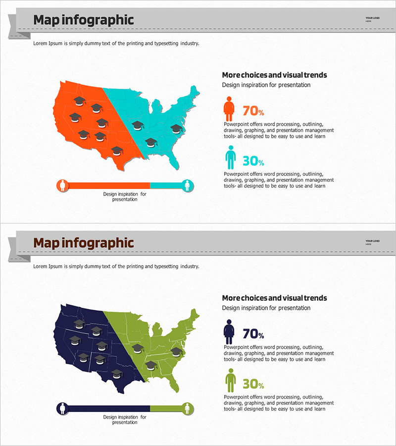
A map infographic PowerPoint slide that visually represents regional data with gender distribution analysis. The US map is divided into orange and turquoise regions to intuitively compare male and female ratios, with 70% and 30% statistics and descriptive text positioned on the right side. Two color combination versions are provided for immediate use in academic data presentations, market analysis, and demographic reports. The slide is designed to make complex regional information instantly understandable to your audience.
Usage Points
-
Main Usage
Visualize regional demographic data, market analysis, and academic statistics through map-based infographics to enhance audience comprehension and support decision-making. Color-coded regions enable intuitive communication of complex geographic information.
-
How to Use
Enter your data into the provided text boxes and numerical fields on the slide. Edit the map colors and statistics to adapt the slide for various regional analysis presentations, and choose between the two color combination options that best suit your content.
-
Recommended For
Ideal for market research reports, demographic analysis presentations, regional business strategy meetings, academic research presentations, and marketing strategy sessions where regional data visualization is essential. Recommended for analysts, researchers, planners, and business professionals.
-
Slide Structure
Two-slide layout with each slide featuring a title area at the top, a color-coded map infographic in the center, a statistics section on the right with percentage icons (70% and 30%), and descriptive text at the bottom. Four editable text areas allow flexible customization of titles, descriptions, and statistical data.
Related Products
-

User Gender Ratio Analysis Diagram
#Market and Competitor Analysis #Graph #Other
-

Customer Analysis by Country Slide – Market Trends and Insights
#Market and Competitor Analysis #Graph #Other
-

Generation Z and Game & Empathy Mechanisms – Market Insights and Customer Analysis
#Market and Competitor Analysis #Marketing Plan and Strategy #Diagram
-

This Unique Challenge Graph – Capturing Growth
#Market and Competitor Analysis #Marketing Plan and Strategy #Graph
