Comparative Analysis Bundle Graph – Visualizing Competitive Advantages
RJ0400072_24
- Last Update 06/07/2025
- File Size 0.2MB
- # of Slides 2
- File Format PPTX
- Slide Ratio 16:9
- Color
Keywords
- #Content-Based Slides
- #Design-Based Slides
- #Product/Service Introduction
- #Market and Competitor Analysis
- #Diagram
- #Other
- #Product and Service Overview
- #Competitive Advantage
- #Cluster
- #Closed Cluster Diagram
- #16:9
- #clustered column chart PowerPoint
- #comparative analysis slide template
- #dual-series bar graph
- #data visualization PPT
- #business comparison slides
- #how to create clustered chart in PowerPoint
- #chart template download
About the Product
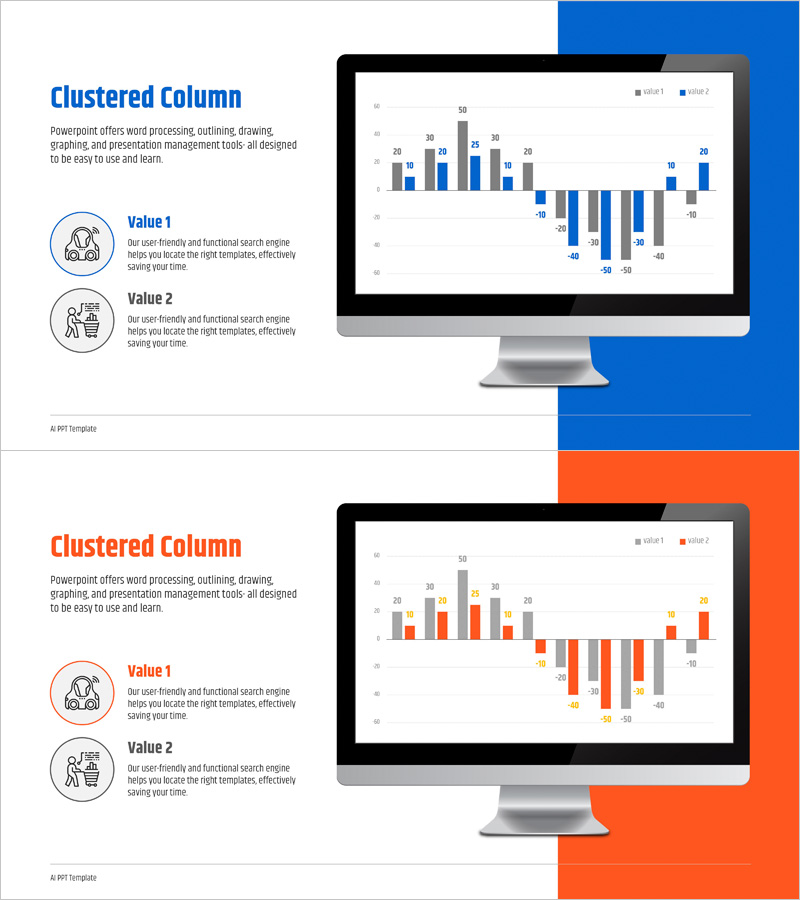
A clustered column chart PowerPoint slide designed to visualize competitive advantages and comparative analysis. This presentation template displays two data series side-by-side for intuitive item-by-item comparison. Perfect for performance benchmarking, competitive analysis, year-over-year growth, and departmental comparisons. The dual-tone blue and orange color scheme clearly distinguishes between the two data series, while the 16:9 widescreen format ensures compatibility with modern displays. Delivered as an editable PPTX file with 2 slides, allowing you to input your data and immediately use it in business presentations, quarterly reports, and strategic proposals.
Usage Points
-
Main Usage
Compare two or more data series across multiple categories to identify differences, trends, and competitive advantages at a glance. Ideal for competitive benchmarking, departmental performance reviews, year-over-year analysis, product feature comparisons, and market share assessments that require clear visual differentiation between data sets.
-
How to Use
Double-click the data values on the slide to replace them with your own figures; the chart updates automatically. Modify axis labels and legend text to match your document context, and adjust colors to align with corporate branding guidelines if needed. Insert into business plans, quarterly reports, executive presentations, and proposals to enhance data credibility and decision-making impact.
-
Recommended For
Marketing managers, sales directors, financial analysts, executives, management consultants, and business strategists who rely on data-driven decision-making. Particularly valuable during competitive analysis, performance evaluation, budget allocation, and strategic planning phases where comparative data visualization is essential.
-
Slide Structure
Two-slide template featuring dual-series clustered column charts. Each slide displays 10 data categories on the horizontal axis with a numerical range (-50 to 50) on the vertical axis. Positive and negative values are positioned above and below the center line to clearly represent growth and decline. Includes legend, data labels, and gridlines for enhanced information clarity.
Related Products
-

Art Science Closed Diagram – Creative Idea Gear
#Product/Service Introduction #Diagram #Graph
-

Global IT Financial Services Overview – Leveraging the Latest Trends
#Product/Service Introduction #Diagram #Other
-

Nature and Deer Reindeer Silhouette – A Presentation Template Capturing the Beauty of Life
#Product/Service Introduction #Diagram #Other
-

Competitive Strengths Comparison Chart – An Effective Market Analysis Tool
#Product/Service Introduction #Market and Competitor Analysis #Diagram
