Comparative Analysis Bar Graph – Data-Driven Market Insights
RJ0400071_18
- Last Update 06/06/2025
- File Size 5.2MB
- # of Slides 2
- File Format PPTX
- Slide Ratio 16:9
- Color
Keywords
- #Content-Based Slides
- #Design-Based Slides
- #Market and Competitor Analysis
- #Graph
- #Competitor Analysis
- #Market Analysis
- #Horizontal Bar
- #Grouped Horizontal Bar
- #16:9
- #horizontal bar chart PowerPoint
- #grouped bar graph template
- #year-over-year comparison slide
- #data comparison chart
- #bar chart slide design
About the Product
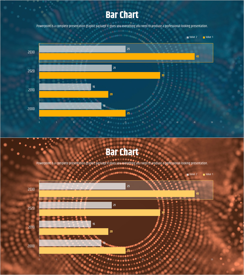
A grouped horizontal bar chart PowerPoint slide optimized for year-over-year data comparison. This presentation template displays two data series side by side across four years (2000, 2010, 2020, 2030), enabling intuitive visual comparison of performance metrics. The dark blue background contrasts with gray and orange bars, with numerical labels at the end of each bar for precise data reading. Ideal for market analysis, competitive benchmarking, and performance trend presentations, this slide is ready to edit and customize for your specific data.
Usage Points
-
Main Usage
This slide compares two data series side by side across multiple time periods or categories. It is designed for quantitative comparative analysis such as market size trends, competitor performance benchmarking, departmental revenue comparison, and year-over-year growth metrics. The bar length visually communicates numerical differences while labels ensure accuracy.
-
How to Use
Open the slide and select the existing data to replace it with your own figures. Bar colors and background can be customized to match your company branding. Year labels or category names are fully editable, allowing you to adapt the slide for various comparative analyses. Text labels and numerical values can be freely modified.
-
Recommended For
Recommended for marketing teams presenting market analysis, sales teams reporting competitive comparisons, finance teams analyzing year-over-year performance, executive briefings, consulting proposals, and business plan presentations requiring data visualization sections.
-
Slide Structure
Two-slide set featuring a dark blue background with four years (2000, 2010, 2020, 2030) displayed horizontally. Each year shows two grouped bars (gray and orange) representing Value 1 and Value 2. Numerical labels appear at the bar ends with a legend for series identification. Formatted in 16:9 widescreen for modern presentation environments.
Related Products
-

Medical Record Analysis Bar Graph – Market and Competitor Analysis
#Market and Competitor Analysis #Graph #Competitor Analysis
-

Blue Orange Bundle Bar Graph - Insights for Market Analysis
#Market and Competitor Analysis #Graph #Competitor Analysis
-

Horizontal Bar Chart for Financial Business Market Analysis
#Market and Competitor Analysis #Graph #Competitor Analysis
-

Horizontal Bar Graph for Competitor Analysis – Effective Data Visualization
#Market and Competitor Analysis #Graph #Competitor Analysis
