Cloud System Comparison Analysis Graph – Visualizing Competitive Advantage
RJ0400070_29
- Last Update 06/06/2025
- File Size 0.1MB
- # of Slides 2
- File Format PPTX
- Slide Ratio 16:9
- Color
Keywords
- #Content-Based Slides
- #Design-Based Slides
- #Market and Competitor Analysis
- #Graph
- #Competitor Analysis
- #Competitive Advantage
- #Horizontal Bar
- #Double Horizontal Bar
- #16:9
- #diverging bar chart PowerPoint
- #left-right comparison graph
- #symmetric bar chart slide
- #competitive analysis graph
- #data comparison presentation
About the Product
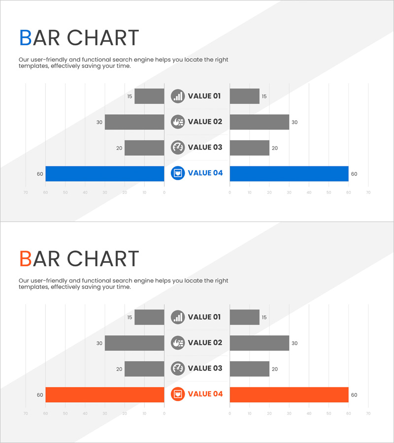
A diverging bar chart PowerPoint slide designed for comparing cloud systems, competitive analysis, and product benchmarking with data displayed symmetrically on both sides. Four data items (VALUE 01–04) are positioned left and right from a central axis, with the highlighted item (VALUE 04) emphasized in blue or orange to draw attention to key metrics. Optimized for 16:9 widescreen format in a 2-slide PPTX file, fully editable and ready to use. Ideal for business presentations, market analysis, competitive advantage visualization, and performance comparisons.
Usage Points
-
Main Usage
Presents bilateral data comparison with symmetrical bar placement for intuitive analysis. Effective for cloud system comparisons, competitor benchmarking, product performance contrasts, and market share analysis. Color differentiation of the highlighted item emphasizes key messages and competitive advantages.
-
How to Use
Enter numerical values for each item and bar lengths adjust automatically. Position left and right data symmetrically to highlight differences and competitive positioning. Customize colors to emphasize specific items or add icons to reinforce meaning and context for each data point.
-
Recommended For
Executive reports, investor pitch decks, marketing strategy presentations, product launch materials, competitive analysis documents, and market research reports. Particularly valuable for B2B presentations requiring technology comparisons, performance benchmarking, and cost-benefit analysis.
-
Slide Structure
Two-slide set featuring blue-accent and orange-accent versions. Each slide displays four items (VALUE 01–04) with bars positioned symmetrically left and right from a central axis, including a 0–70 numerical scale, icons, and labels. Optimized for 16:9 aspect ratio with full editability.
Related Products
-

Strategic Competitor Analysis Graph – Visualizing Your Competitive Edge
#Market and Competitor Analysis #Graph #Competitor Analysis
-

Competitor Analysis Bilinear Bar Graph – Visualizing Market Advantage
#Market and Competitor Analysis #Graph #Competitor Analysis
-

Competitor Paired Bar Graph – Market Analysis and Comparison
#Market and Competitor Analysis #Graph #Competitor Analysis
-

Competitive Comparison Analysis Bar Graph – Visualizing Market Advantage
#Market and Competitor Analysis #Graph #Competitor Analysis
