Comparative Analysis Line Graph – Market and Competitor Analysis
RJ0400059_13
- Last Update 06/02/2025
- File Size 0.9MB
- # of Slides 2
- File Format PPTX
- Slide Ratio 16:9
- Color
Keywords
- #Content-Based Slides
- #Design-Based Slides
- #Market and Competitor Analysis
- #Graph
- #Competitor Analysis
- #Competitive Advantage
- #Line
- #Line Chart
- #16:9
- #line chart PowerPoint
- #dual-series line graph
- #market analysis slide
- #competitor comparison chart
- #data trend visualization
- #comparative analysis presentation
About the Product
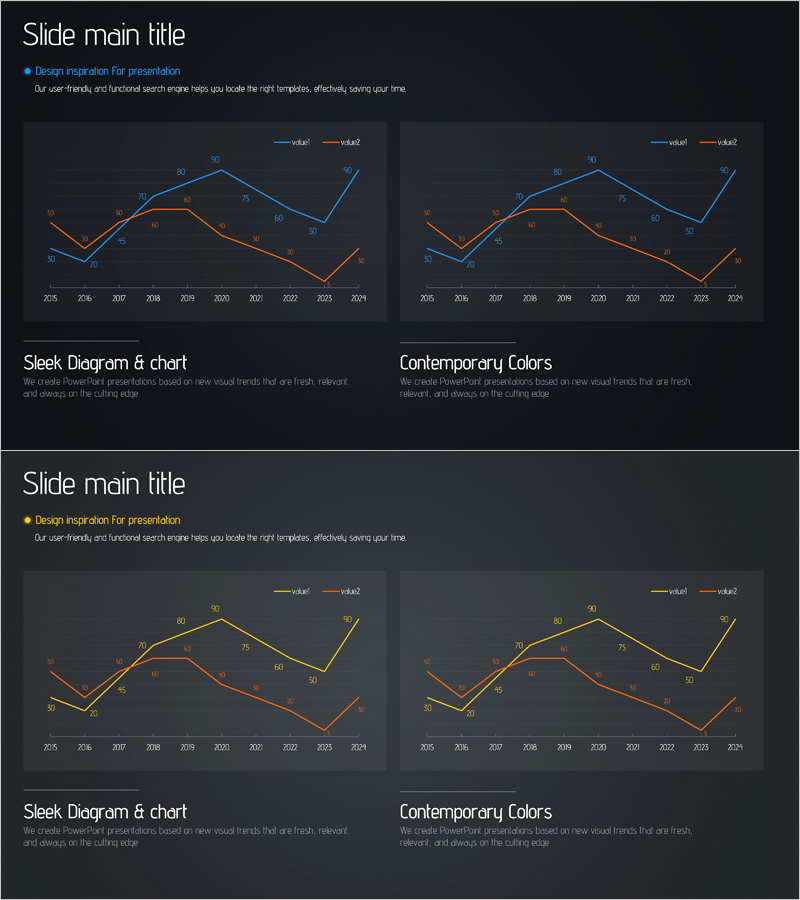
A dual-series line chart PowerPoint slide optimized for market analysis and competitive benchmarking. The slide features two trend lines in blue and orange against a dark background, tracking data changes from 2005 to 2024 with precise numerical labels at each data point. Grid lines and legend enhance readability and data accuracy. Ideal for business presentations, quarterly reports, investor pitches, and strategic planning decks where competitive positioning, market dynamics, and performance metrics require clear visual comparison. Fully editable in 16:9 widescreen format across 2 slides.
Usage Points
-
Main Usage
Visualize market trends and competitive performance side-by-side using two distinct trend lines. The dual-series format enables clear comparison of growth rates, market share evolution, and competitive positioning over time, making complex data relationships immediately understandable to executives and stakeholders.
-
How to Use
Deploy in business strategy presentations, quarterly earnings reports, investor relations meetings, and competitive analysis workshops. Customize the legend and axis labels to match your data, input your values, and the chart automatically scales. Works seamlessly in board meetings, client pitches, and internal strategy sessions.
-
Recommended For
C-suite executives, strategy teams, marketing departments, and sales leaders presenting data-driven insights. Consultants, business analysts, and product managers benefit from this template when communicating market research findings. Particularly valuable in finance, technology, manufacturing, and retail sectors where competitive analysis drives decision-making.
-
Slide Structure
Two-slide layout, each featuring one dual-series line chart. X-axis displays years (2005–2024), Y-axis shows numerical values. Blue and orange trend lines with labeled data points at each interval. Dark background with contrasting bright line colors. Horizontal gridlines facilitate accurate value reading and comparison.
Related Products
-

Competitor Comparative Analysis Slide – Emphasizing Market and Competitiveness
#Market and Competitor Analysis #Graph #Text Box
-

Mobile App Competitor Analysis – Visualizing Market Share
#Market and Competitor Analysis #Graph #Other
-

Blue Green Broken Line Graph – Competitor Analysis
#Market and Competitor Analysis #Graph #Competitor Analysis
-

Competitor Analysis Comparison Graph – Visualizing Market Shares
#Market and Competitor Analysis #Graph #Competitor Analysis
