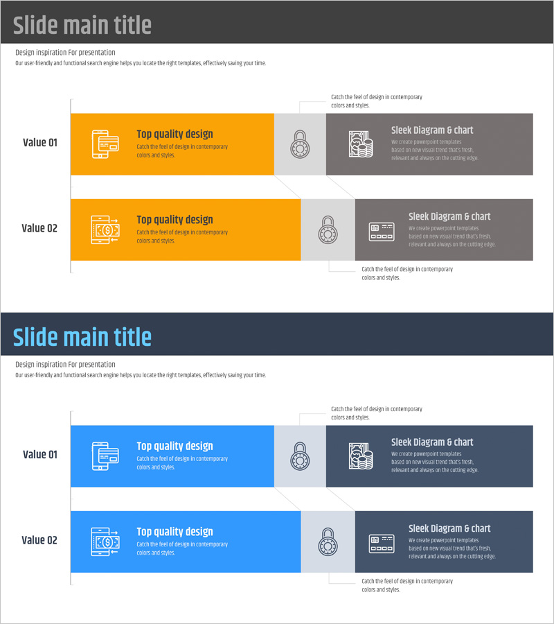
Horizontal Bar Chart Slide Highlighting Fintech Service Composition
RJ0400058_17
- Last Update 06/02/2025
- File Size 0.2MB
- # of Slides 2
- File Format PPTX
- Slide Ratio 16:9
- Color
Keywords
- #Content-Based Slides
- #Design-Based Slides
- #Product/Service Introduction
- #Technical Approach
- #Graph
- #Composition
- #Service Architecture Diagram
- #Horizontal Bar
- #Segmented Horizontal Bar
- #16:9
- #horizontal bar chart PowerPoint
- #fintech presentation slide
- #service composition diagram
- #two-item comparison chart
- #business data visualization
About the Product
A PowerPoint slide featuring a two-item horizontal bar chart that visualizes fintech service composition and comparative data. The design uses a striking orange and gray two-tone color scheme to emphasize contrast, with icons and descriptive text positioned strategically for maximum clarity. This 16:9 widescreen, 2-slide template is ready to use for service structure presentations, feature comparisons, value propositions, and business pitches in the financial technology sector.
Usage Points
-
Main Usage
Clearly visualize fintech service components, feature comparisons, and value propositions using horizontal bar charts. Ideal for investor pitches, service introductions, and executive briefings where complex information must be communicated intuitively and persuasively.
-
How to Use
Each horizontal bar is fully editable—modify text, numbers, and labels to match your data. The orange highlight section carries your key message, while the gray explanation area provides supporting details. Use both slides sequentially to show step-by-step comparisons or temporal progression of service evolution.
-
Recommended For
Fintech startup investor pitch decks, financial institution service launch presentations, IT consulting firm digital transformation proposals, quarterly business performance reports for executives, and financial education seminar materials.
-
Slide Structure
2-slide set. Each slide features a title area at the top, two horizontal bars (orange and gray) in the center, left-aligned icons, and right-aligned descriptive text. Optimized for 16:9 widescreen format in modern presentation environments.
Related Products
-

Transportation Service Layer Structure Diagram Template
#Product/Service Introduction #Technical Approach #Diagram
-

Beer Tree Structure Chart – A New Paradigm of Data Visualization
#Product/Service Introduction #Technical Approach #Diagram
-

Sales Status by Donut Product Visualization – Attractive Graph Design
#Product/Service Introduction #Market and Competitor Analysis #Graph
-

Dinosaur Feature Diagram
#Product/Service Introduction #Technical Approach #Diagram
