Gradient Table Chart for Financial Planning – Harmony of Purple and Blue
RJ0400054_16
- Last Update 06/01/2025
- File Size 0.1MB
- # of Slides 2
- File Format PPTX
- Slide Ratio 16:9
- Color
Keywords
- #Content-Based Slides
- #Design-Based Slides
- #Operational Plan
- #Financial Plans and Performance
- #Diagram
- #Risk Management
- #Balance Sheet
- #Table
- #Standard Table
- #16:9
- #comparison table chart PowerPoint
- #data analysis slide template
- #gradient table presentation
- #financial planning slide
- #how to create comparison table in PowerPoint
About the Product
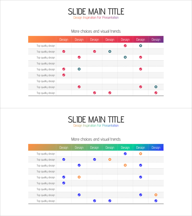
A 9-column comparison table chart PowerPoint slide designed for financial planning and data analysis presentations. Features a smooth gradient header transitioning from orange to purple, with checkmarks and circular icons indicating selection status and progress across items. The 2-slide set accommodates various data comparison scenarios and is ready to use in risk management, operational planning, and financial analysis presentations. Optimized in 16:9 widescreen format for modern projectors and online meetings.
Usage Points
-
Main Usage
Visualize and compare multiple items across financial planning, operational planning, and risk management scenarios. The gradient header and icon system (checkmarks and circles) enable viewers to instantly grasp selection status and progress across all data points.
-
How to Use
Replace row labels and column headers with your own data, then add or remove checkmarks and circular icons to represent comparison results. The color gradient automatically emphasizes visual hierarchy, so positioning critical items first maximizes impact.
-
Recommended For
Finance teams reviewing budget allocation, operations teams reporting project status, risk management teams evaluating risk factors, executive briefings, and investor presentations. Ideal for data-driven decision-making across departments.
-
Slide Structure
2-slide set with each slide containing a 9-column by 9-row table structure. The header features a gradient from orange through yellow, green, and blue to purple. Data is represented using pink and blue checkmarks and circular icons in each cell.
Related Products
-

Origami Concept Table – Visualizing Financial Performance
#Financial Plans and Performance #Diagram #Balance Sheet
-

Four Color Infographic Presentation Table – Visualizing Financial Performance
#Financial Plans and Performance #Diagram #Balance Sheet
-

Data Analysis Table – Visualization of Financial Planning and Performance
#Financial Plans and Performance #Diagram #Balance Sheet
-

Business Task Checklist – Efficient Operational Planning
#Operational Plan #Diagram #Risk Management
