Usage Status and Trends by Application Graph
RJ0400038_12
- Last Update 05/27/2025
- File Size 4.4MB
- # of Slides 2
- File Format PPTX
- Slide Ratio 16:9
- Color
Keywords
- #Content-Based Slides
- #Design-Based Slides
- #Business Introduction
- #Market and Competitor Analysis
- #Graph
- #Market Status
- #Horizontal Bar
- #Horizontal Bar Chart
- #16:9
- #horizontal bar chart PowerPoint
- #app usage status slide
- #application trends presentation
- #market analysis graph
- #how to create bar chart in PowerPoint
About the Product
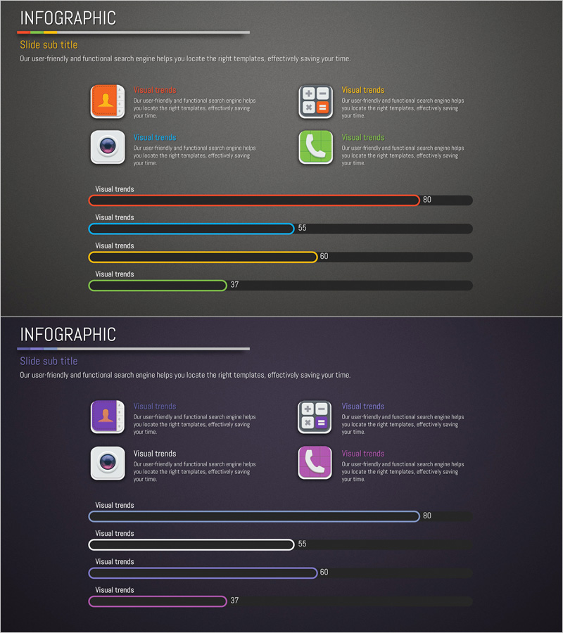
A two-slide PowerPoint presentation featuring horizontal bar charts that visualize application usage status and trends across different platforms. The chart uses four distinct colors—red, blue, yellow, and green—to differentiate each app's usage rate, enabling clear comparative analysis at a glance. Designed for data-driven presentations including market analysis, user statistics, and performance reports, these slides are ready to use immediately. Available in 16:9 widescreen PPTX format, fully editable in all PowerPoint versions.
Usage Points
-
Main Usage
This slide template presents numerical data such as app adoption rates, market share, and user statistics through horizontal bar charts. The visual comparison format allows audiences to instantly grasp relative values, making it ideal for market research findings, product performance metrics, and competitive analysis presentations.
-
How to Use
Simply replace the bar lengths and numerical values with your own data. The color-coded bars clearly distinguish each application, effectively capturing audience attention during presentations. Perfect for marketing plans, business reports, investor pitches, and quarterly performance reviews.
-
Recommended For
Marketing professionals, data analysts, business strategists, and product managers presenting market conditions and user behavior trends. Particularly suited for mobile app companies, software vendors, and online service providers preparing internal reports and external presentations.
-
Slide Structure
Two-slide set, each featuring a horizontal bar chart with four data series (red, blue, yellow, green bars). Numerical values appear at the right end of each bar. Dark background enhances data visibility and creates professional contrast for business presentations.
Related Products
-

4-Person Household User Analysis Graph – Customer Insight
#Market and Competitor Analysis #Graph #Market Status
-

Test Tube Bar Graph for Market Analysis – Highlighting Competitive Advantage
#Market and Competitor Analysis #Graph #Market Status
-

Target Country Market Analysis Graph
#Market and Competitor Analysis #Graph #Other
-

Truck Logistics Equipment Status Analysis – Trust and Efficiency
#Business Introduction #Market and Competitor Analysis #Graph
