Service User Ratio Analysis Infographic – Red and Blue
RJ0400028_12
- Last Update 05/25/2025
- File Size 1MB
- # of Slides 2
- File Format PPTX
- Slide Ratio 16:9
- Color
Keywords
About the Product
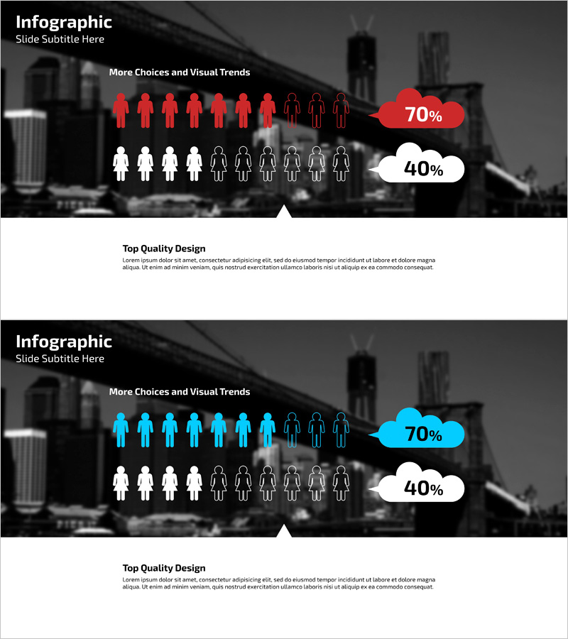
A PowerPoint slide that visually compares service user ratios using contrasting red and blue color schemes. Human icons are arranged to represent percentages like 70% and 40%, with cloud-shaped percentage badges positioned over a city skyline background. This layout enables intuitive data communication for market analysis, customer segmentation, and user demographic presentations. The 2-slide set provides color variations (red-dominant and blue-dominant versions) so you can select the version that matches your presentation context. Minimal text input areas keep focus on data visualization, while the 16:9 widescreen format ensures compatibility with modern presentation environments. Fully editable and ready for immediate use in business reports and investor pitches.
Usage Points
-
Main Usage
Visualize service user and customer segment ratio differences at a glance using contrasting icon counts and colors. Communicates percentage comparisons (e.g., 70% vs 40%) through human icons and color contrast, enhancing audience comprehension. Ideal for market overview, customer analysis, and user trend presentations where key insights need emphasis.
-
How to Use
Replace the 'More Choices and Visual Trends' heading with your presentation context. Update the percentage badges with actual data and adjust human icon counts as needed. The city background can be retained or filtered to match your company brand colors. Both slides are fully editable in PowerPoint.
-
Recommended For
Marketing, sales, and strategy teams presenting market analysis; investor pitches explaining customer segmentation; product development teams sharing user trends; executive reports highlighting ratio comparisons. Especially effective when emphasizing differences between two groups or demographics.
-
Slide Structure
2-slide set with each slide featuring a city skyline background (top dark area) + human icon array (center) + percentage cloud badges (right) + description area (bottom). First slide emphasizes red; second emphasizes blue. Choose the color version that best fits your presentation flow and brand identity.
Related Products
-

User Gender Ratio Analysis Diagram
#Market and Competitor Analysis #Graph #Other
-

Customer Analysis Gender Ratio Analysis Graph - Key to Market Understanding
#Market and Competitor Analysis #Graph #Other
-

Learning Content Customer Analysis Slide - Intuitive Graphs and Data Visualization
#Market and Competitor Analysis #Marketing Plan and Strategy #Graph
-

Gender Ratio Customer Analysis 3D Circle Graph – Insights for Market Understanding
#Market and Competitor Analysis #Graph #Other
