Technology Services Market Share and Status Graph – Yellow and Red
RJ0400027_14
- Last Update 05/25/2025
- File Size 2MB
- # of Slides 2
- File Format PPTX
- Slide Ratio 16:9
- Color
Keywords
About the Product
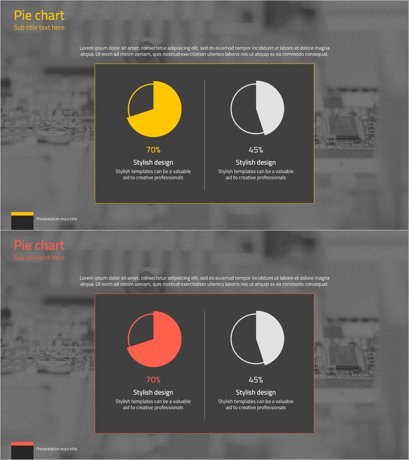
A PowerPoint slide that visualizes technology services market share and current status using two pie chart segments for direct comparison. The contrasting yellow and red color scheme represents 70% and 45% proportions respectively, with white-bordered circular charts prominently displayed against a dark background. This slide structure is ready for immediate use in market analysis, business performance reports, and competitive positioning sections of presentations. Available in 16:9 aspect ratio, PPTX format, fully editable across all PowerPoint versions.
Usage Points
-
Main Usage
Designed to simultaneously visualize proportional data for two items such as market share, market status, or competitive comparison in the technology services sector. The clearly segmented pie charts enable instant comprehension of composition ratios for each item, while the contrasting yellow and red color scheme effectively differentiates the two datasets.
-
How to Use
Insert this slide into business reports, market analysis presentations, and executive briefing materials within the market share section. Input actual percentage values and descriptive text below each pie chart to clearly communicate data significance. Colors and numerical values are fully editable, allowing customization to match corporate brand colors or actual dataset requirements.
-
Recommended For
Ideal for technology and IT company executive reports, market analysis presentations, and investor briefing materials. Marketing managers, business planners, and management analysts can use this slide to explain market conditions and competitive positioning. Also suitable for academic presentations and consulting reports requiring data comparison visualization.
-
Slide Structure
Two pie charts arranged horizontally on a dark gray background. The left pie chart displays yellow at 70%, while the right shows white and black at 50% proportions. Each chart includes percentage values and descriptive text areas below. A title section appears at the top with a presentation main title bar positioned at the bottom.
Related Products
-

Pie Chart for Market Share Analysis – Data Visualization
#Market and Competitor Analysis #Graph #Market Status
-

Market Targets and Status Chart – Visually Appealing Insights
#Market and Competitor Analysis #Graph #Market Status
-

City and Nature Pie Chart Statistics – Visualization of Market Status
#Market and Competitor Analysis #Graph #Market Status
-

Breakdown of Industry Market Share – Insights through Data Visualization
#Market and Competitor Analysis #Graph #Market Status
