US Map Target Market Strategy – Marketing Plan and Analysis
RJ0400026_18
- Last Update 05/24/2025
- File Size 0.3MB
- # of Slides 2
- File Format PPTX
- Slide Ratio 16:9
- Color
Keywords
- #Content-Based Slides
- #Design-Based Slides
- #Market and Competitor Analysis
- #Marketing Plan and Strategy
- #Other
- #Target Market
- #Target Market Strategy
- #16:9
- #US map PowerPoint slide
- #market analysis presentation
- #target market strategy slide
- #regional market analysis PPT
- #how to create market analysis in PowerPoint
About the Product
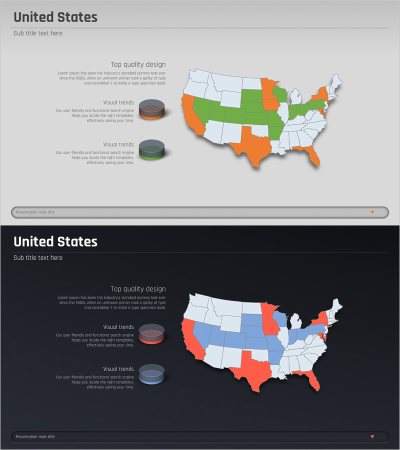
A PowerPoint slide that divides the entire United States into three color zones (green, orange, white) to compare target markets, growth regions, and untapped territories at a glance. The 2-slide set provides both light and dark background versions to match your presentation theme. The left side features text input areas and 3D pie chart elements, allowing you to present qualitative insights and quantitative data simultaneously. Ideal for marketing strategy presentations, market entry planning, and regional sales analysis. Delivered in 16:9 widescreen PPTX format, fully editable in all PowerPoint versions.
Usage Points
-
Main Usage
Visually segment the US market into target regions, growth areas, and untapped territories using color-coded mapping. Effectively communicate market positioning during strategy planning sessions and executive briefings, enabling data-driven decision-making for regional expansion.
-
How to Use
Enter regional market characteristics, entry strategies, and revenue projections in the left text areas. Input regional percentages, growth rates, or market share data into the 3D pie charts to strengthen visual comparison. Select the light background for bright-themed presentations or the dark background for dark-themed presentations.
-
Recommended For
Marketing managers, sales strategy teams, executive presentations, investor pitch decks, new market entry planning meetings, and regional sales strategy development. Particularly valuable for companies planning North American market expansion, providing credible data visualization in the market analysis section.
-
Slide Structure
Two-slide layout with each slide containing one title area, two left-side text input zones (top description and bottom description), one right-side US map visualization, and two 3D pie charts in the lower left. The 1:1 balance between text and visual elements enables simultaneous presentation of qualitative analysis and quantitative metrics.
Related Products
-

Analysis of the US Target Map – Target Market Strategy
#Market and Competitor Analysis #Marketing Plan and Strategy #Other
-

European Target Area Goals – Market and Marketing Strategy Analysis
#Market and Competitor Analysis #Marketing Plan and Strategy #Other
-

Target Area Status Analysis Graph
#Market and Competitor Analysis #Marketing Plan and Strategy #Graph
-

Asian Target Area Analysis – Visualizing Market Strategies
#Market and Competitor Analysis #Marketing Plan and Strategy #Diagram
