Medical Market Analysis Bar Segmentation Graph
RJ0400012_19
- Last Update 05/20/2025
- File Size 1.7MB
- # of Slides 2
- File Format PPTX
- Slide Ratio 16:9
- Color
Keywords
- #Content-Based Slides
- #Design-Based Slides
- #Market and Competitor Analysis
- #Graph
- #Market Analysis
- #Horizontal Bar
- #Segmented Horizontal Bar
- #16:9
- #100% stacked bar chart PowerPoint
- #stacked horizontal bar graph template
- #market analysis presentation slide
- #medical market data visualization
- #4-series comparison chart
About the Product
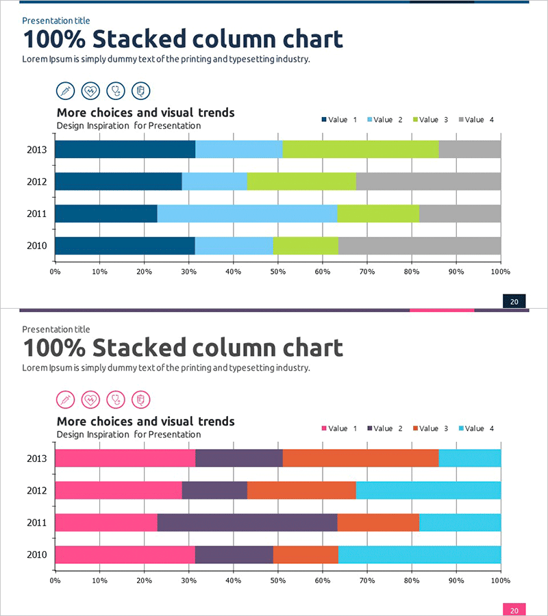
A professional 100% stacked horizontal bar chart PowerPoint slide designed for medical market analysis and competitive comparison. The 2-slide template displays four data series (2010–2013) in a stacked format, using a color palette of dark blue, light blue, lime green, and gray to distinguish each value clearly. The horizontal axis spans 0–100% with year labels, enabling intuitive visualization of proportion changes over time. Four icon indicators at the top provide visual emphasis. This presentation slide is ready to use for medical industry reports, market share analysis, product comparison presentations, and strategic planning documents.
Usage Points
-
Main Usage
Visualize market share, competitive positioning, and year-over-year growth rates across four data series in a 100% stacked format, making composition changes immediately apparent. Ideal for reports, analytical presentations, investor briefings, and strategic communications where multi-series proportion data must be clearly conveyed.
-
How to Use
Two identically structured slides allow you to present multiple analysis categories or demonstrate changes across different time periods. Replace the generic labels (Value 1–4) and year markers (2010–2013) with your actual data. Adjust colors and legend text as needed to match your corporate branding or presentation theme.
-
Recommended For
Pharmaceutical and medical device companies presenting market analysis, quarterly performance reviews to executives, consulting firms delivering industry insights, investor relations presentations, academic research papers, and strategic planning sessions requiring multi-dimensional data comparison.
-
Slide Structure
Each slide contains a title area, subtitle text, four icon indicators in a row, a 100% stacked horizontal bar chart with four color-coded series, a legend identifying each series, a 0–100% horizontal axis, and year labels (2010–2013). Both slides maintain consistent layout for cohesive presentation flow.
Related Products
-

Business Area Analysis Graph & PC Mockup
#Technical Approach #Market and Competitor Analysis #Graph
-

Simple Cement Theme Analysis Chart – Understanding Competitor and Market Context
#Market and Competitor Analysis #Diagram #Graph
-

Target Market Analysis Data Table - Market Growth Statistics
#Market and Competitor Analysis #Graph #Other
-

Pie Chart & Bar Graph for Market Analysis – Visualizing Data
#Market and Competitor Analysis #Graph #Market Status
