Presentation Design Using Doughnut Chart – Style and Professionalism
RJ0400007_5
- Last Update 05/18/2025
- File Size 0.5MB
- # of Slides 2
- File Format PPTX
- Slide Ratio 16:9
- Color
Keywords
About the Product
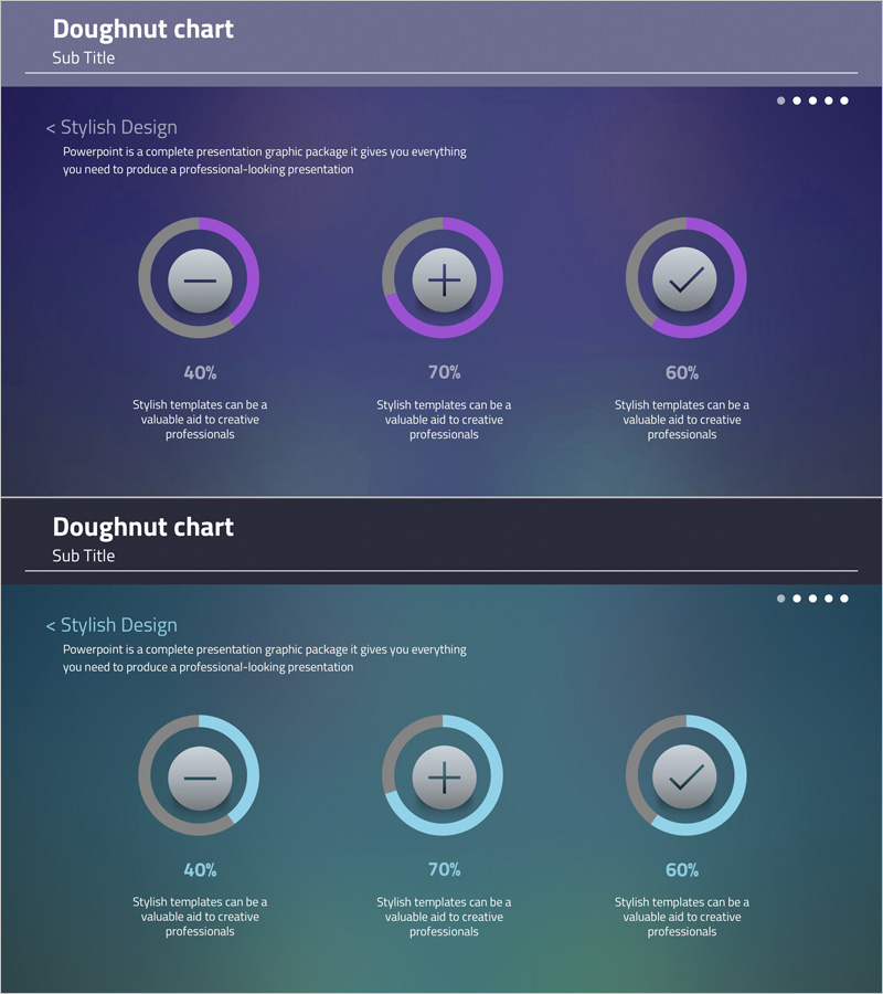
A 2-slide PowerPoint set featuring doughnut charts for data visualization. The slides display three concentric doughnut charts on a purple-to-teal gradient background, each representing 40%, 70%, and 60% values. Icons (minus, plus, checkmark) are embedded within the chart centers to indicate progress status or completion levels. This presentation template is optimized for communicating proportions, composition, achievement rates, and satisfaction metrics in professional business presentations and reports.
Usage Points
-
Main Usage
Visualize numerical data such as percentages, composition, achievement rates, satisfaction scores, and completion status using doughnut chart format. Icons within chart centers enhance status indication and information clarity.
-
How to Use
Apply in business reports, marketing plans, performance analysis, and quarterly reviews to display goal achievement rates, market share, customer satisfaction, and project progress. Simply input text and values for immediate presentation use.
-
Recommended For
Executives, marketing managers, project managers, data analysts, and educators presenting quantitative information. Ideal for business presentations, performance reviews, strategic planning sessions, and stakeholder meetings.
-
Slide Structure
2-slide layout with three horizontally arranged concentric doughnut charts per slide. Each chart includes independent percentage values (40%, 70%, 60%) and descriptive text areas. Purple-to-teal gradient background with gray doughnut rings and pink accent colors create visual hierarchy.
Related Products
-

Shareholder Status Analysis Donut Chart – Insights and Analysis
#Company Introduction #Market and Competitor Analysis #Diagram
-

Key Shareholder Analysis One Donut Chart
#Company Introduction #Market and Competitor Analysis #Graph
-

Doughnut Chart for Shareholder Composition Analysis – Emphasizing Trust and Transparency
#Company Introduction #Market and Competitor Analysis #Graph
-

Market Demand Analysis PowerPoint Slide – Donut Chart Layout
#Market and Competitor Analysis #Graph #Customer Analysis
