Blue Pink Market Share Donut Pie Chart
RJ0400006_18
- Last Update 05/18/2025
- File Size 1.5MB
- # of Slides 2
- File Format PPTX
- Slide Ratio 16:9
- Color
Keywords
- #Content-Based Slides
- #Design-Based Slides
- #Technical Approach
- #Market and Competitor Analysis
- #Graph
- #Innovative Technologies and Future Plans
- #Market Share
- #Circles
- #Doughnut Chart
- #16:9
- #donut chart PowerPoint
- #pie chart slide template
- #market share visualization
- #ratio comparison graph
- #donut pie chart download
- #PowerPoint graph slide design
About the Product
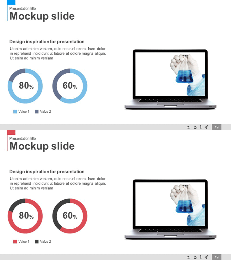
A professional donut pie chart PowerPoint slide featuring blue and pink color schemes for data visualization. This 2-slide template displays comparative metrics with 80% and 60% ratio representations, ideal for presenting market share, sales distribution, customer satisfaction, and competitive analysis. The clear color differentiation on a clean background enhances data comprehension during presentations. Perfect for technology sector pitches, innovation strategy discussions, and future planning presentations. Fully editable PPTX format with instant customization capabilities.
Usage Points
-
Main Usage
Visualize comparative data such as market share percentages, sales distribution, customer satisfaction ratings, and technology stack ratios. The donut chart format effectively communicates part-to-whole relationships, making it essential for executive reports, investor presentations, and technical briefings where key metrics require emphasis.
-
How to Use
Click on each donut chart to access the data editing interface. Replace 'Value 1' and 'Value 2' labels with your category names and update the percentage values with actual data. The chart automatically recalculates proportions. To modify colors, select the chart shape and adjust the fill options in the formatting menu.
-
Recommended For
Technology companies presenting tech stack comparisons, marketing teams analyzing market penetration, sales departments comparing performance metrics, executive dashboards, investor pitch decks, strategic planning sessions, and quarterly business reviews. Particularly effective when emphasizing dual-category percentage comparisons.
-
Slide Structure
2-slide layout with dual donut pie charts per slide. First chart displays 80% ratio, second chart shows 60% ratio. Both charts feature blue and pink color segments with legend and text areas positioned on the right. Optimized for 16:9 widescreen format with balanced spacing and professional typography.
Related Products
-

How to Protect Your Environment Pie Chart
#Market and Competitor Analysis #Graph #Market Status
-

Development Status Donut-Shaped Circle Graph
#Product/Service Introduction #Market and Competitor Analysis #Diagram
-

Green Orange Market Share Visualization – Data-Driven Insights
#Market and Competitor Analysis #Graph #Other
-

Family Travel Survey Analysis Chart – Market Share and Status
#Market and Competitor Analysis #Graph #Market Status
