Company Stock Analysis Diagram – Stylish Design for Presentations
RJ0300067_23
- Last Update 05/07/2025
- File Size 13.9MB
- # of Slides 2
- File Format PPTX
- Slide Ratio 16:9
- Color
Keywords
- #Content-Based Slides
- #Design-Based Slides
- #Company Introduction
- #Business Introduction
- #Diagram
- #Business Areas
- #Business Areas
- #Cluster
- #Spread
- #Chain Diagram
- #Decentralized Diagram
- #16:9
- #pie diagram PowerPoint
- #4-section chart slide
- #radial diagram template
- #data visualization presentation
- #business analysis PPT slide
About the Product
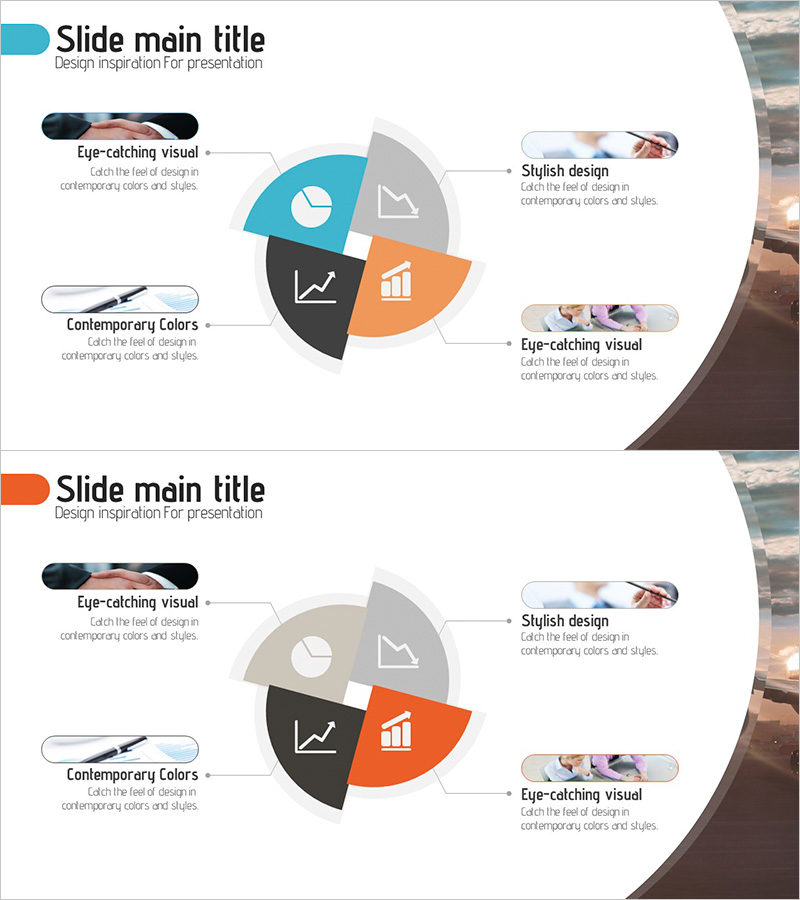
A PowerPoint slide template for visualizing the proportional relationships of four key business metrics such as company stock analysis, business performance analysis, and marketing data distribution. The center-focused radial structure uses turquoise, orange, black, and gray to distinguish each section, with embedded icons (pie chart, line graph, bar chart) that intuitively convey data meaning. Speech bubble text boxes positioned on both left and right sides allow you to highlight key insights and analysis points. The 2-slide set includes color variations (turquoise emphasis and orange emphasis) for flexible presentation styling. Ready to use immediately in business presentations and reports.
Usage Points
-
Main Usage
Visualize proportional relationships of four business metrics including company stock analysis, business performance breakdown, marketing channel distribution, customer segmentation, and product portfolio composition. The center-focused radial structure presents each section with equal visual weight while using color contrast to emphasize key areas.
-
How to Use
Input numerical data into each pie section and write analysis results or key insights in the left and right speech bubble text boxes. Replace or supplement the icon areas with detailed charts, graphs, or text relevant to each metric. Use the color variation slides to shift emphasis between different sections across multiple presentation slides.
-
Recommended For
Finance team stock analysis presentations, marketing team channel performance reports, executive briefings, business plan pitches, investor relations (IR) materials, quarterly performance reviews, and data-driven decision-making presentations. Ideal for any business context requiring clear visualization of four-way data distribution.
-
Slide Structure
Center-focused 4-section radial pie diagram. Each section color-coded: turquoise (top-left), gray (top-right), black (bottom-left), orange (bottom-right). Icons (pie chart, line graph, bar chart) embedded within each section. Three speech bubble text boxes positioned at top-left, top-right, and mid-right. 2-slide set with color emphasis variations (turquoise-focused and orange-focused layouts).
Related Products
-

Core Business Area Diagram – Segmentation and Expansion
#Company Introduction #Business Introduction #Diagram
-

Main Business Areas Triangle Diagram
#Company Introduction #Business Introduction #Diagram
-

Internet of Things Service Area Diagram – Business Introduction and Visualization
#Company Introduction #Business Introduction #Diagram
-

Financial Business Triangle Diagram – Visualization of Business Areas
#Company Introduction #Business Introduction #Diagram
