Spade Shape Graph – Market and Competitor Analysis
RJ0300033_5
- Last Update 04/27/2025
- File Size 1.4MB
- # of Slides 2
- File Format PPTX
- Slide Ratio 16:9
- Color
Keywords
About the Product
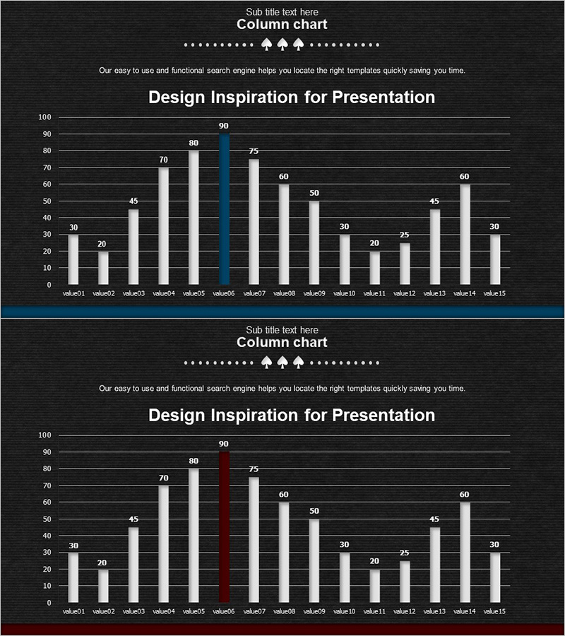
A vertical column chart PowerPoint slide optimized for market analysis and competitor comparison presentations. The dark background features white, gray, blue, and red column bars that clearly visualize numerical data across 15 items. Data point labels appear above each bar for precise value communication, while horizontal gridlines facilitate easy reading of values. The 2-slide set presents the same data with different accent colors—blue and red—allowing flexible selection based on presentation context. Provided in editable PPTX format, enabling you to input your own data and complete your presentation efficiently.
Usage Points
-
Main Usage
Compares multiple numerical values—such as market size, competitor performance, sales volume, or customer satisfaction—at a glance. Bar height intuitively conveys relative size differences, while numerical labels simultaneously display exact values. Ideal for business presentations, strategic planning, and market research reports.
-
How to Use
Insert into the analysis or results section of your presentation to support data-driven arguments. The blue-accent version suits highlighting positive performance, while the red-accent version works well for emphasizing risk factors or improvement areas. Add interpretation notes for each item in the slide notes for reference during presentation delivery.
-
Recommended For
Marketing, sales, and executive presentations; market analysis reports; competitor benchmarking materials; quarterly or annual performance reports; investment pitch decks; business plan documents requiring data visualization sections.
-
Slide Structure
2-slide set. Each slide features a vertical column chart with Y-axis range 0–100 and X-axis spanning 15 items (value01–value15). The first slide uses blue accent color; the second uses red accent, presenting identical data with different emphasis. All bars display numerical labels above them, and horizontal gridlines aid value interpretation.
Related Products
-

Pie & Bar Analysis Graphs – Optimized for Market and Competitor Analysis
#Market and Competitor Analysis #Graph #Competitor Analysis
-

Big Data Analysis Template Intro
#Market and Competitor Analysis #Graph #Competitor Analysis
-

Vertical Bar Standard Color Chart for Market Analysis – Market and Competitor Analysis
#Market and Competitor Analysis #Graph #Competitor Analysis
-

Comparative Analysis Vertical Bar Graph for Market Insights
#Market and Competitor Analysis #Graph #Other
