Graph
Green Yellow Comparison Graph - Insights through Data Visualization
RJ0900015_14
- Last Update 12/21/2025
- File Size 0.6MB
- # of Slides 2
- File Format PPTX
- Slide Ratio 16:9
- Color
About the Product
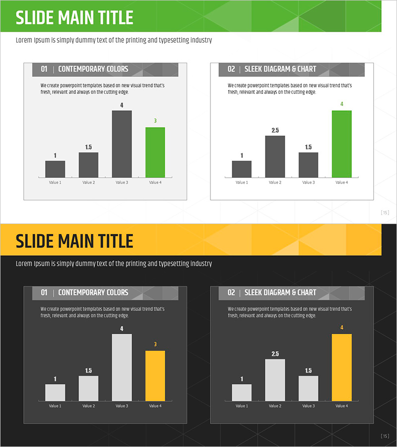
This slide features a comparison graph combining green and yellow colors to visually represent data intuitively. The left side presents a simple bar chart paired with design elements that hint at data flow, allowing users to easily grasp the changes in information. It is ideal for market analysis, performance reports, and data-driven presentations. Effectively used in documents aimed at practitioners or executives, it clarifies complex data presentation. Editing difficulty is moderate, making it easy to replace text and chart data, and insights or notes can be added as needed.
Related Products
-
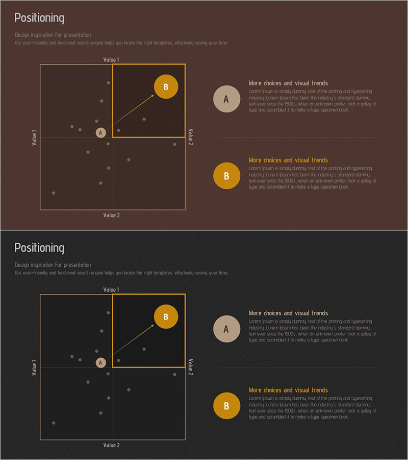
Competitive Comparison Analysis Positioning Map
#Marketing Plan and Strategy #Graph #Other
-
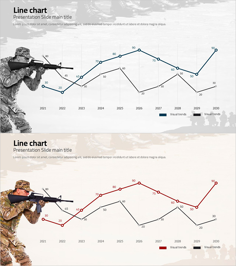
War and Broken Line Graph – Market and Competitor Analysis Strategy
#Business Promotion Strategy #Market and Competitor Analysis #Graph
-
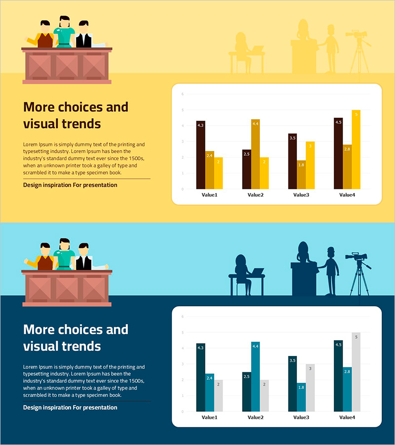
Trial PowerPoint Bundled Graph – Competitive Advantage Analysis
#Market and Competitor Analysis #Graph #Competitive Advantage
-

Travel Plan Donut Chart – Market Share Analysis
#Market and Competitor Analysis #Graph #Market Status
