
Company Introduction
Navy Yellow Pie Charts and Analysis - Effective Data Visualization
RJ0900001_8
- Last Update 12/21/2025
- File Size 0.2MB
- # of Slides 2
- File Format PPTX
- Slide Ratio 16:9
- Color
Keywords
About the Product
This presentation slide uses a navy and yellow color scheme to visually analyze data through pie charts. Designed to clearly convey key achievements and technology status, it features a smooth visual design and is complemented with text boxes and sticky note elements to enhance communication efficiency. Targeted towards corporate practitioners, professionals, and startup teams, this slide helps deliver effective data presentations.
Related Products
-
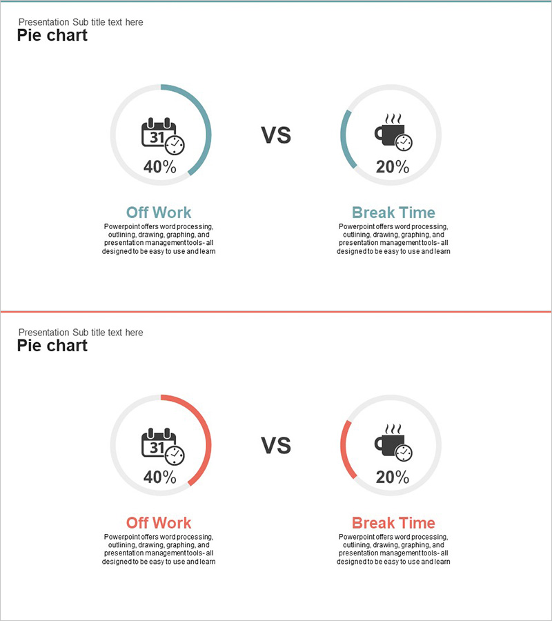
Holiday vs. Break Time Analysis Graph – Understanding Work Efficiency Through Statistics
#Product/Service #Market and Competitor Analysis #Graph
-
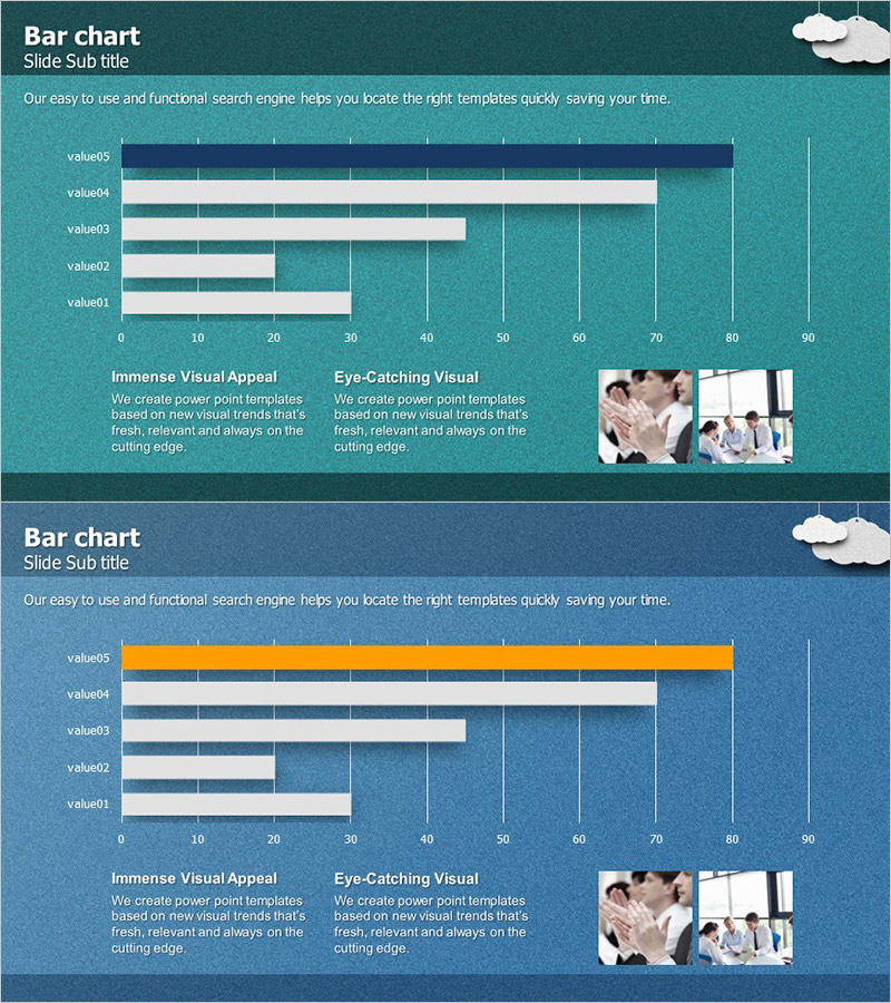
Key Performance Analysis Bar Graph – Visualization of KPIs
#Company Introduction #Market and Competitor Analysis #Graph
-

Diagram Slide for Planning Remodeling Work
#Product/Service #Business Introduction #Diagram
-
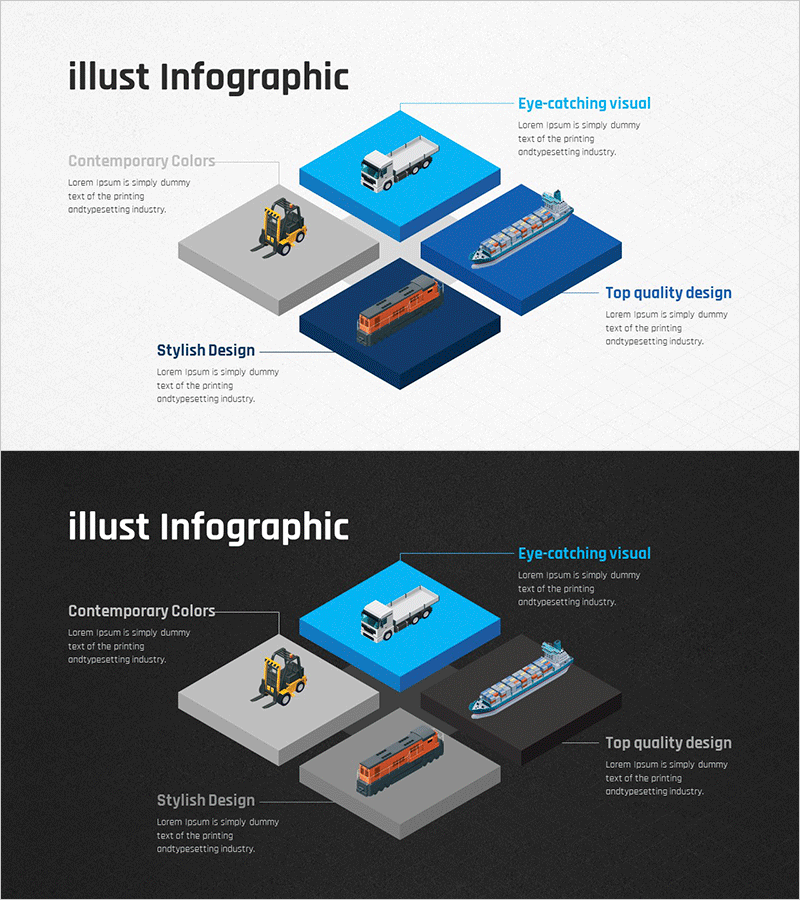
Logistics Transportation Service Area Diagram – Visual Innovation
#Company Introduction #Business Introduction #Diagram
