Market and Competitor Analysis
Graph of Changes After a Healthy Diet – Data Visualization Template
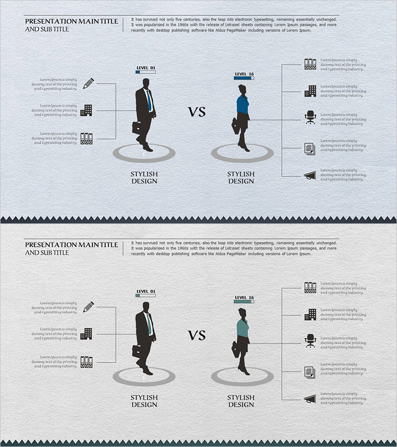
RJ0600054_6
- Last Update 12/21/2025
- File Size 2.1MB
- # of Slides 2
- File Format PPTX
- Slide Ratio 16:9
- Color
Keywords
About the Product
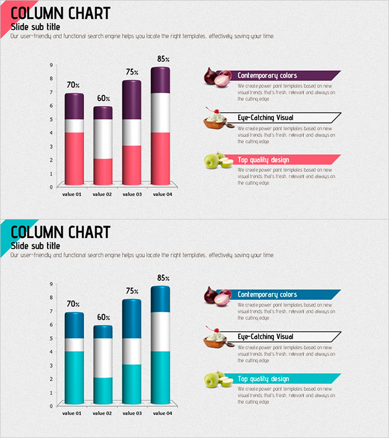
This slide features a graph template that visually represents the changes after implementing a healthy diet. Combining horizontal and vertical bar charts, it clearly compares and effectively communicates the data. Utilizing contemporary colors like purple, red, and blue enhances visual interest, making it suitable for health and wellness presentations, marketing materials, or internal reports. The editing difficulty is rated 'easy', allowing for straightforward replacement of data and text.
Related Products
-
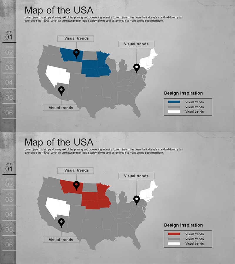
US Target Market Strategy – Data-Driven Market Analysis
#Market and Competitor Analysis #Marketing Plan and Strategy #Other
-
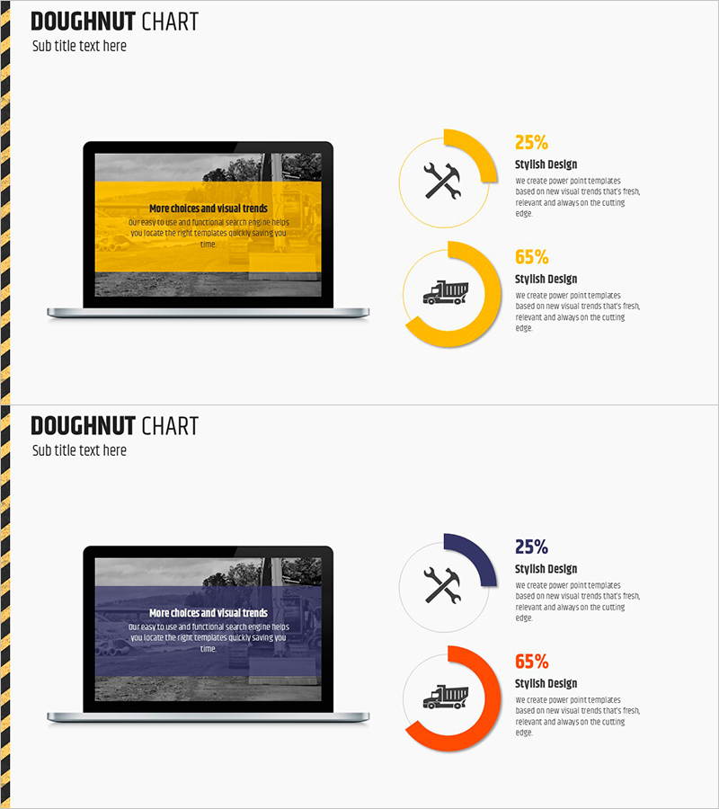
Equipment Demand Survey with Donut Chart – Data Visualization
#Product/Service #Graph #Other
-
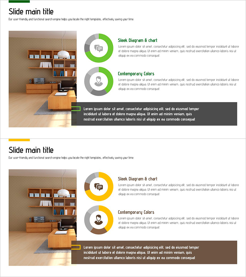
Donut Chart for Interior Satisfaction Survey
#Market and Competitor Analysis #Customer Success Stories #Graph
-
Comparison of Company Employee Job Fields – Understanding Diverse Roles of Employees
#Technology Sector #Market and Competitor Analysis #Diagram
