Graph
Bundled Horizontal Bar Graph – Data Comparison and Visual Appeal
RJ0600017_31
- Last Update 12/21/2025
- File Size 0.1MB
- # of Slides 2
- File Format PPTX
- Slide Ratio 16:9
- Color
Keywords
About the Product
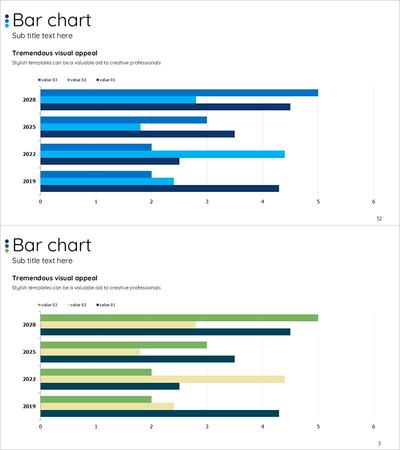
This slide features a bundled horizontal bar graph that effectively compares multiple data points. With a combination of blue and green colors, the visually appealing chart clearly represents each item's comparison, allowing users to easily grasp the data. This template is exceptionally suitable for year-on-year performance, marketing impact analysis, and business performance reports. The editing difficulty is rated as 'easy', enabling rapid adaptation to various presentations with straightforward modifications of text and data areas.
Related Products
-
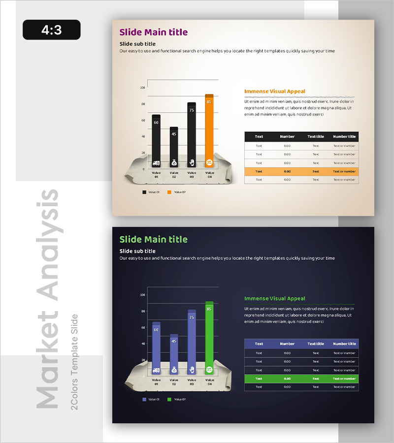
Comparative Analysis of Eco-Friendly Categories Slide – Market Competitive Advantage
#Market and Competitor Analysis #Financial Plans and Performance #Diagram
-
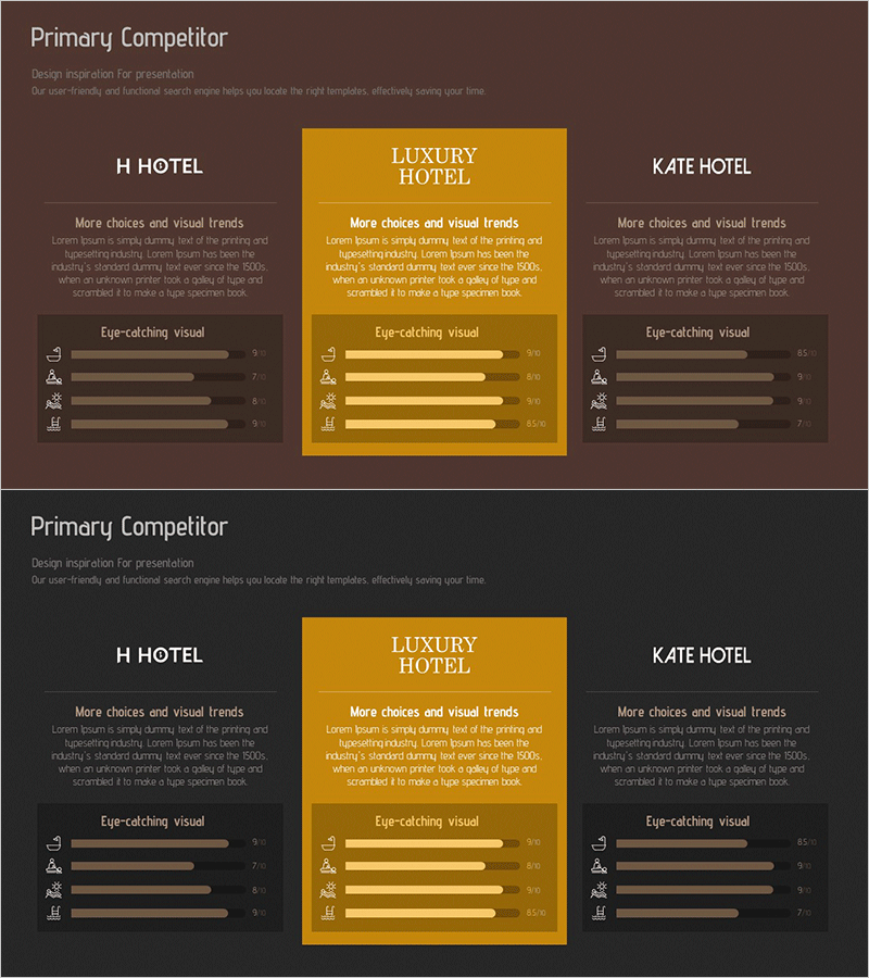
Competitive Hotel Service Comparison Analysis Diagram
#Market and Competitor Analysis #Graph #Competitor Analysis
-
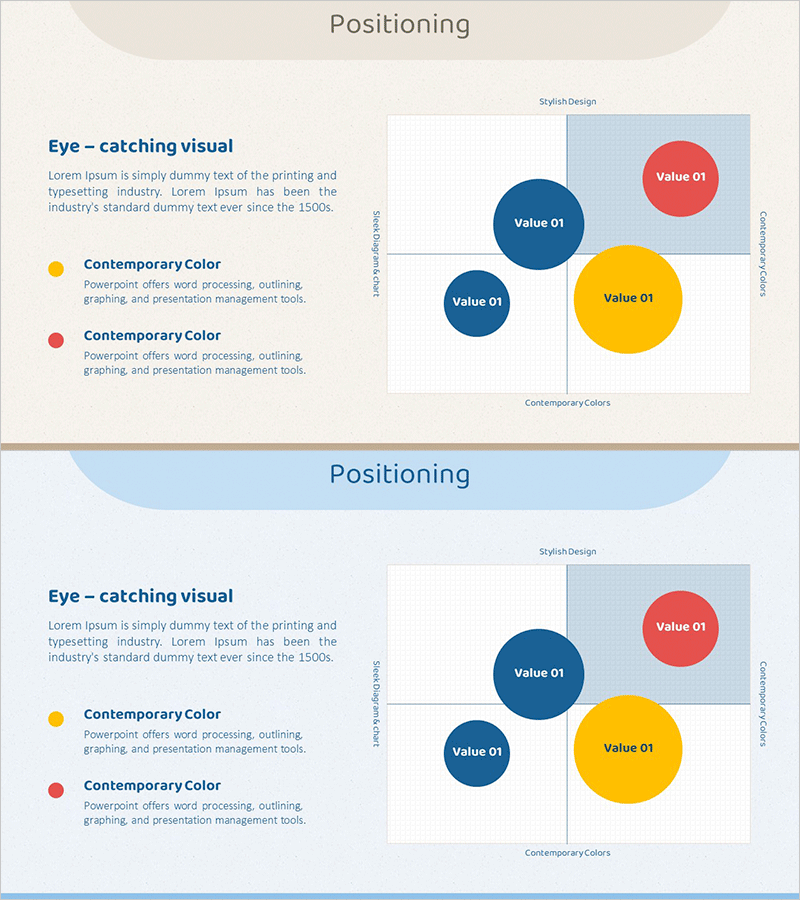
Point Distribution Positioning Map – Visualizing Marketing Strategies
#Marketing Plan and Strategy #Graph #Other
-
Market Share Analysis with Pie Chart – Precise Data Visualization
#Company Introduction #Market and Competitor Analysis #Graph
