Market and Competitor Analysis
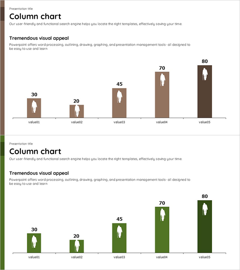
Bar Graph Visualizing Elderly Population Ratio
RJ0600001_6
- Last Update 12/21/2025
- File Size 0.2MB
- # of Slides 2
- File Format PPTX
- Slide Ratio 16:9
- Color
Keywords
About the Product
This slide features a vertical bar graph that intuitively displays the elderly population ratio. With a visually appealing structure for data comparison, it is useful for market analysis and customer segment research. The brown and green color theme conveys trust and safety, while the clear title area at the top enhances message delivery. This slide is perfect for reports or presentations related to elderly population data or the aging issue in Korean society. Users can easily replace text and data, and its editing difficulty is rated as 'easy', allowing for quick integration into various situations.
Related Products
-

Comparison of Traditional Business Sales – Performance and Competitive Advantage Analysis
#Business Promotion Strategy #Market and Competitor Analysis #Graph
-
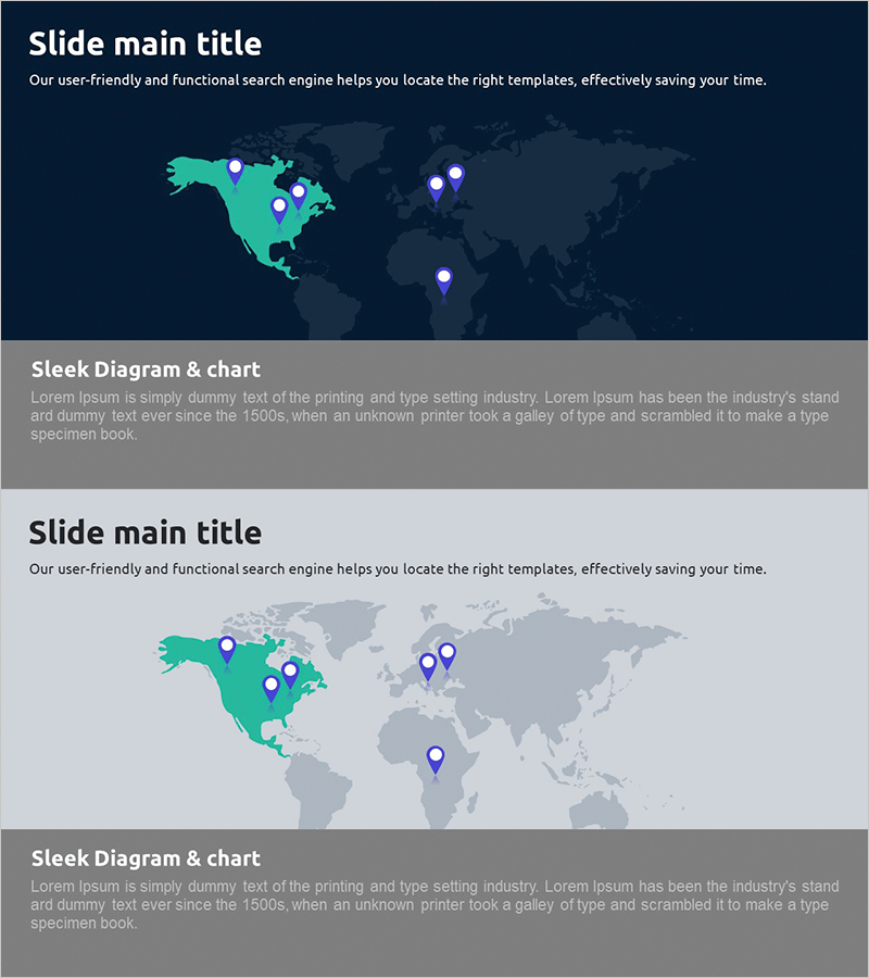
Global Target Market Analysis – Map for Market Understanding
#Company Introduction #Market and Competitor Analysis #Other
-
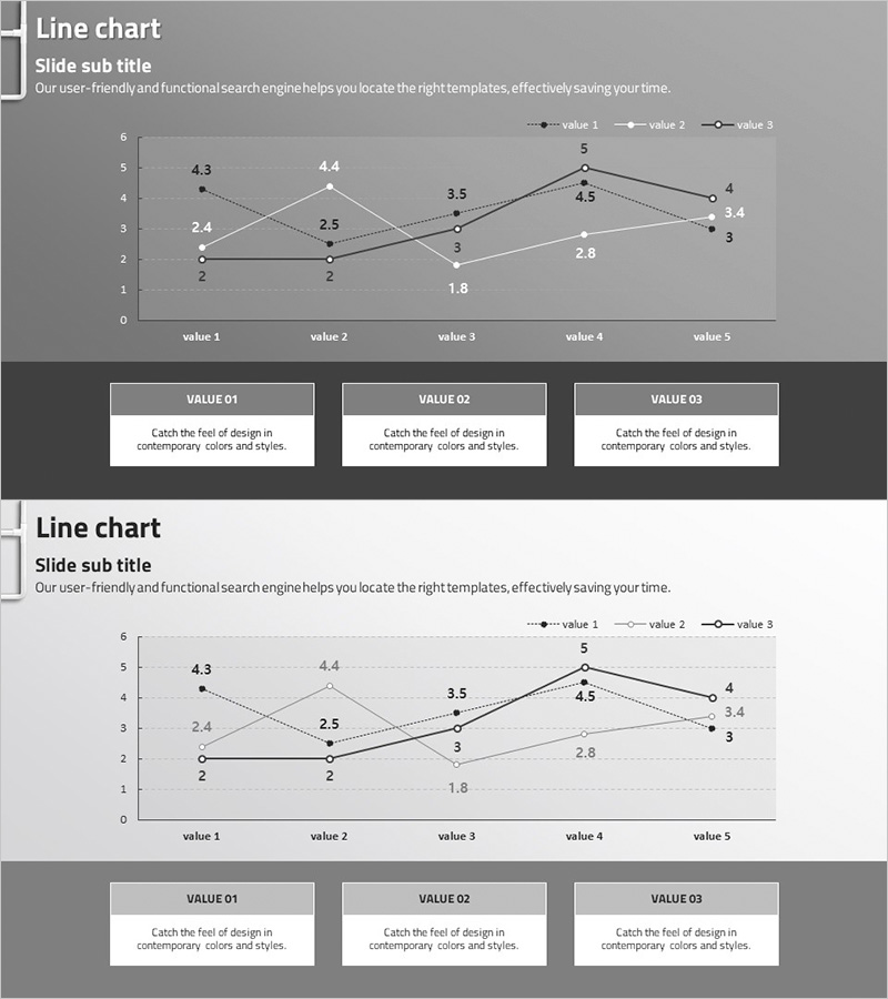
Competitor Analysis Broken Line Graph – Visualizing Market Trends
#Market and Competitor Analysis #Diagram #Graph
-
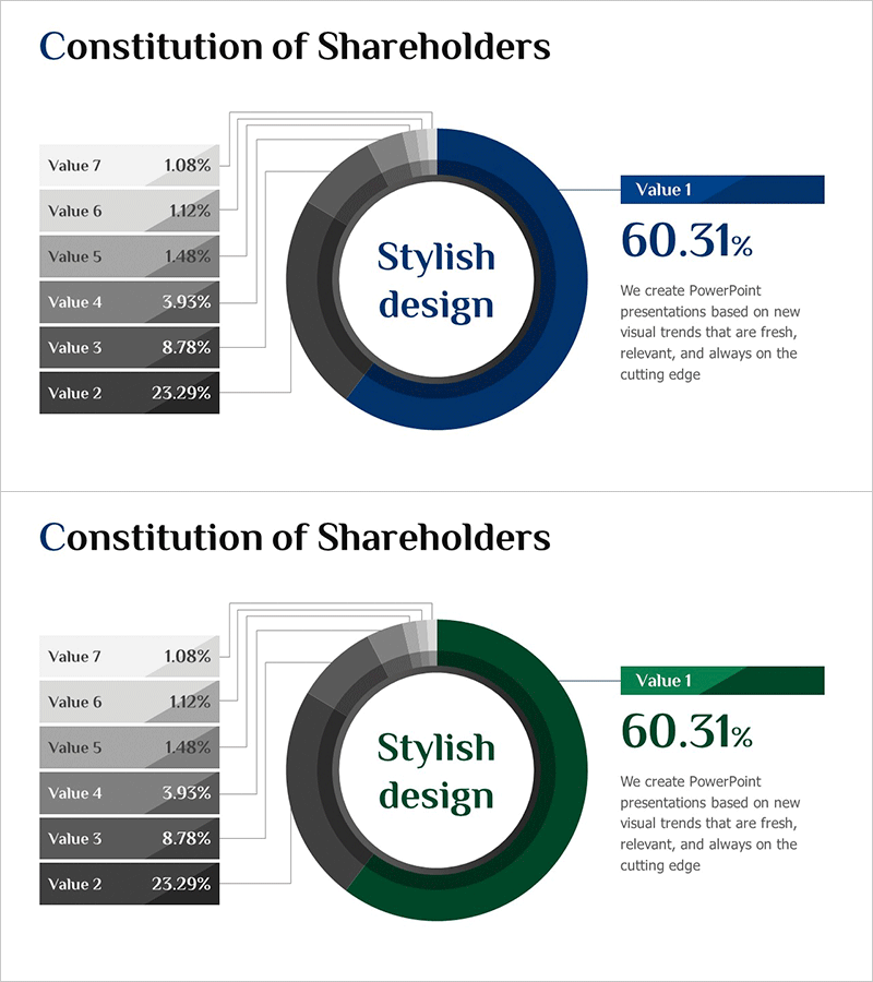
Chart of Changes in the Ratio of Institutional and Individual Investors – Simplified Shareholder Composition
#Company Introduction #Market and Competitor Analysis #Graph
