Product/Service
Drone Performance Comparison Analysis Graph – Data Visualization
RJ0400040_8
- Last Update 12/21/2025
- File Size 0.2MB
- # of Slides 2
- File Format PPTX
- Slide Ratio 16:9
- Color
Keywords
About the Product
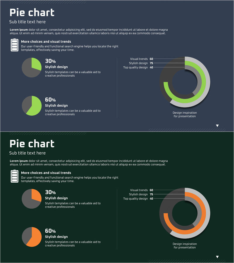
This slide visualizes the comparison analysis of drone performance using a pie chart. With a green and orange color scheme, it emphasizes the performance differences among various drone models, making data easily understandable. Ideal for market and competitive analysis reports, this slide captures the sentiment of 'efficient analysis'. It is designed to fit various business presentations and reports. The text and graph can be easily replaced, making the editing difficulty moderate.
Related Products
-

Visualizing Characteristics of Each Cat - Cluster Diagram
#Product/Service #Market and Competitor Analysis #Diagram
-
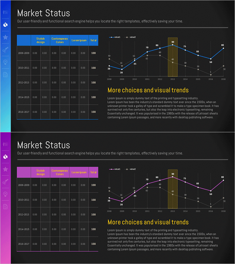
Sales and Profit Analysis Graph – Market Trends and Forecast
#Market and Competitor Analysis #Diagram #Graph
-
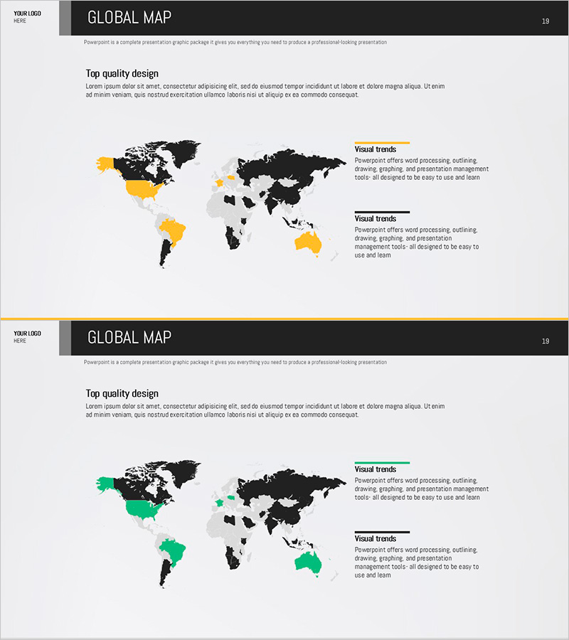
Export Target Market Map – A Strategic Tool for Global Market Analysis
#Company Introduction #Market and Competitor Analysis #Other
-
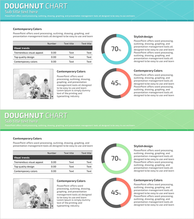
Science Experiment Analysis Circle Graph Table Chart – Technological Advancement
#Product/Service #Technology Sector #Diagram
