Market Analysis with Hologram Map and Chart – Contemporary Visual Design
RJ0200053_16
- Last Update 04/13/2025
- File Size 1.6MB
- # of Slides 2
- File Format PPTX
- Slide Ratio 16:9
- Color
Keywords
- #Content-Based Slides
- #Design-Based Slides
- #Market and Competitor Analysis
- #Marketing Plan and Strategy
- #Other
- #Market Analysis
- #Target Market Strategy
- #Map
- #16:9
- #global map PowerPoint slide
- #world map presentation template
- #market analysis map slide
- #gradient background chart PPT
- #regional data visualization PowerPoint
About the Product
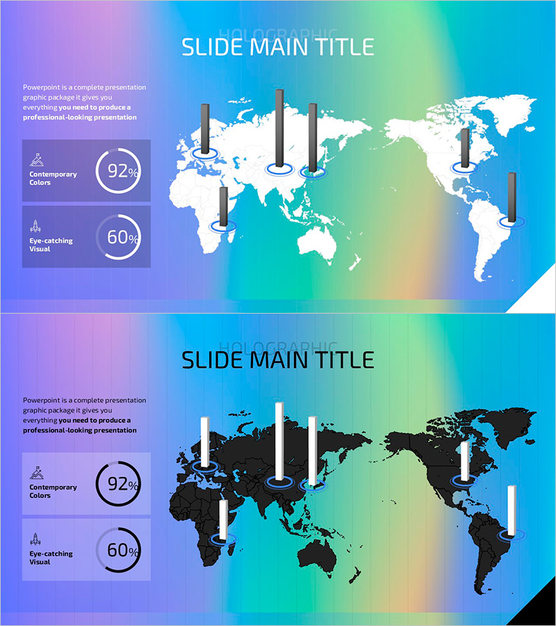
A professional PowerPoint slide featuring a world map with data visualization on a vibrant gradient background transitioning from purple to cyan. The 2-slide set includes one layout with a white map overlaid with dark bar charts and another with a black map and white bars, creating strong visual contrast. The left panel contains text areas with circular progress indicators (92%, 60%) for key metrics. Perfect for market analysis, regional performance reports, and global strategy presentations. Each slide functions as a standalone infographic or paired comparison, making it ideal for business presentations, investor pitches, and executive briefings.
Usage Points
-
Main Usage
Visualize global market trends, regional sales performance, international network distribution, and overseas business results using map-based data representation. Ideal for investor presentations, executive reports, and strategic planning meetings where geographic data insights drive decision-making.
-
How to Use
Input region names, numerical values, and key metrics in the left text panel. Adjust bar chart heights on the world map to match your data. Use both slides sequentially to show temporal changes or compare different metrics across regions with consistent visual formatting.
-
Recommended For
Global enterprises, marketing teams, and sales departments presenting international business performance. Suitable for market analysis reports, regional performance reviews, international expansion strategies, and fundraising pitch decks.
-
Slide Structure
Each slide contains a title area at the top, left panel with two circular metric indicators (displaying percentages like 92%, 60%), and right section with world map and corresponding bar chart overlay. Both slides maintain identical layout for consistent data comparison and professional presentation flow.
Related Products
-

U.S. National Renewable Energy Implementation Regional Analysis - Green Mint
#Market and Competitor Analysis #Marketing Plan and Strategy #Other
-

Curved Theme Purple Map Template – Market Analysis and Strategy
#Market and Competitor Analysis #Marketing Plan and Strategy #Other
-

Automobile Market Export Volume Visualization Slide – Market Analysis and Strategy
#Market and Competitor Analysis #Marketing Plan and Strategy #Diagram
-

Analysis of Eco-Farming Agriculture Distribution by Region in the United States
#Market and Competitor Analysis #Marketing Plan and Strategy #Other
