Data Visualization Slide – Emphasizing Quality and Colors
RJ0200052_8
- Last Update 04/13/2025
- File Size 0.5MB
- # of Slides 3
- File Format PPTX
- Color
Keywords
About the Product
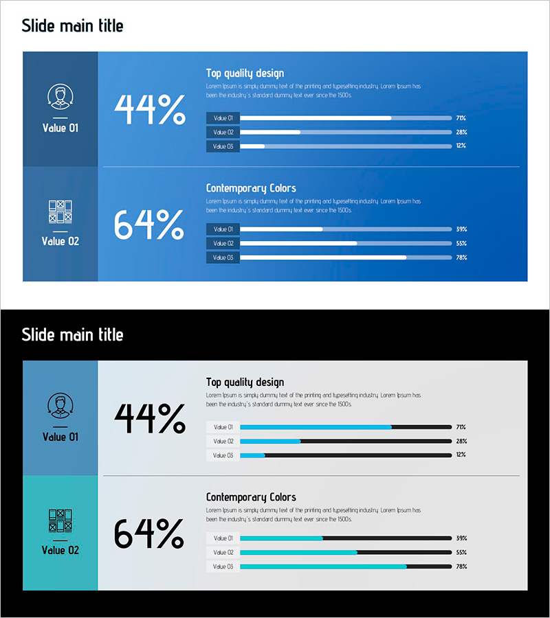
A professional data visualization PowerPoint slide designed for market analysis presentations. This slide features a two-column layout with an icon section on the left and a chart section on the right, enabling simultaneous comparison of two key metrics. The dark blue background combined with bright blue accent bars and white typography ensures optimal data readability and visual impact. Each metric includes descriptive text and a three-tier comparative bar chart, making it ideal for market overview, competitive analysis, and market share comparisons. The 16:9 widescreen PPTX format ensures compatibility across all presentation environments.
Usage Points
-
Main Usage
Effectively communicate two key market metrics side-by-side in your market analysis presentation. This slide transforms raw data into clear visual comparisons, supporting decision-making with competitive positioning, market share trends, and market opportunity analysis.
-
How to Use
Enter metric names in the left icon area and input numerical data in the right chart section. The template accommodates both percentage and absolute value data. Customize chart colors and text to match your corporate branding. Ideal for business plans, investor presentations, and marketing strategy documents.
-
Recommended For
Market researchers, marketing strategists, business development professionals, and executives preparing competitive analysis and market opportunity reports. Particularly effective for SWOT analysis, competitor benchmarking, and market share presentations.
-
Slide Structure
Three-slide set with consistent two-column layout: left icon area (Value 01, Value 02) and right data visualization area (three-item percentage bar charts). Clear separation of title, descriptive text, and data input zones enables rapid customization and professional presentation delivery.
Related Products
-

Pie Chart Slide for Status of Service Technology Development
#Product/Service Introduction #Market and Competitor Analysis #Graph
-

Market Share Analysis Area & Pie Chart – The Power of Data Visualization
#Product/Service Introduction #Market and Competitor Analysis #Graph
-

Idea Development Status Donut Graph – Effective Market Analysis
#Product/Service Introduction #Market and Competitor Analysis #Graph
-

Current Status Analysis Pie Chart – Insights for Market Analysis
#Product/Service Introduction #Market and Competitor Analysis #Diagram
