Modern Blue Presentation Bar Chart
RJ0200035_23
- Last Update 04/07/2025
- File Size 0.8MB
- # of Slides 2
- File Format PPTX
- Slide Ratio 16:9
- Color
Keywords
- #Content-Based Slides
- #Design-Based Slides
- #Company Introduction
- #Market and Competitor Analysis
- #Graph
- #Future Outlook
- #Horizontal Bar
- #Grouped Horizontal Bar
- #16:9
- #grouped bar chart PowerPoint
- #horizontal bar graph template
- #year-over-year comparison slide
- #data visualization presentation
- #multi-series chart download
About the Product
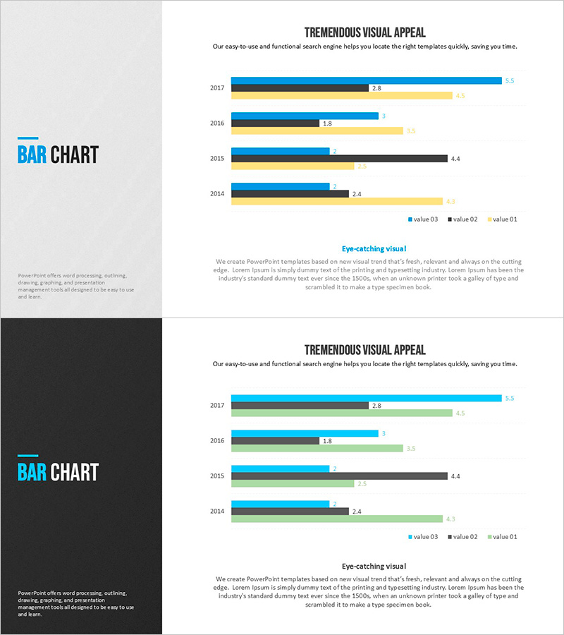
A grouped horizontal bar chart PowerPoint slide designed for comparing multi-year data across four series. Displays data from 2014 to 2017 with bars arranged side-by-side in blue, black, and yellow colors for clear differentiation. Data labels appear at the end of each bar for precise value communication. This 16:9 widescreen 2-slide template is ideal for business presentations including market analysis, sales performance reports, and quarterly results reviews. The grouped layout enables instant comparison of trends and performance metrics across multiple categories and time periods.
Usage Points
-
Main Usage
Compare numerical data across multiple years and categories simultaneously. Visualize performance trends, competitive benchmarking, regional sales comparisons, and quarterly revenue analysis. The grouped bar layout makes it easy to identify patterns and differences between series.
-
How to Use
Bar length represents data magnitude for intuitive comparison. Data labels provide exact values. Color legend distinguishes each series. Insert into marketing reports, quarterly earnings presentations, market research documents, and executive dashboards to enhance audience comprehension.
-
Recommended For
Sales and marketing managers presenting performance metrics, executives reviewing annual results, consulting firms explaining market research findings, finance teams analyzing revenue trends, product managers comparing competitive positioning.
-
Slide Structure
2-slide template in 16:9 widescreen format. Each slide features grouped horizontal bars for years 2014-2017 with three color series (blue, black, yellow) arranged side-by-side. Data labels positioned at bar ends. Horizontal orientation enables easy value comparison across multiple data points.
Related Products
-

Positive Performance Analysis Chart
#Company Introduction #Market and Competitor Analysis #Graph
-

Future Outlook Analysis Graph – Market and Competitive Analysis
#Market and Competitor Analysis #Graph #Other
-

Visualizing Business Strategy with Bar Charts – Market Analysis and Future Outlook
#Market and Competitor Analysis #Diagram #Graph
-

Performance Advantage Analysis Chart – Evolving Business Success
#Company Introduction #Market and Competitor Analysis #Diagram
