Modern Blue Presentation Diagram2 – Effective Visualization of Service Composition
RJ0200035_12
- Last Update 04/07/2025
- File Size 0.8MB
- # of Slides 2
- File Format PPTX
- Slide Ratio 16:9
- Color
Keywords
About the Product
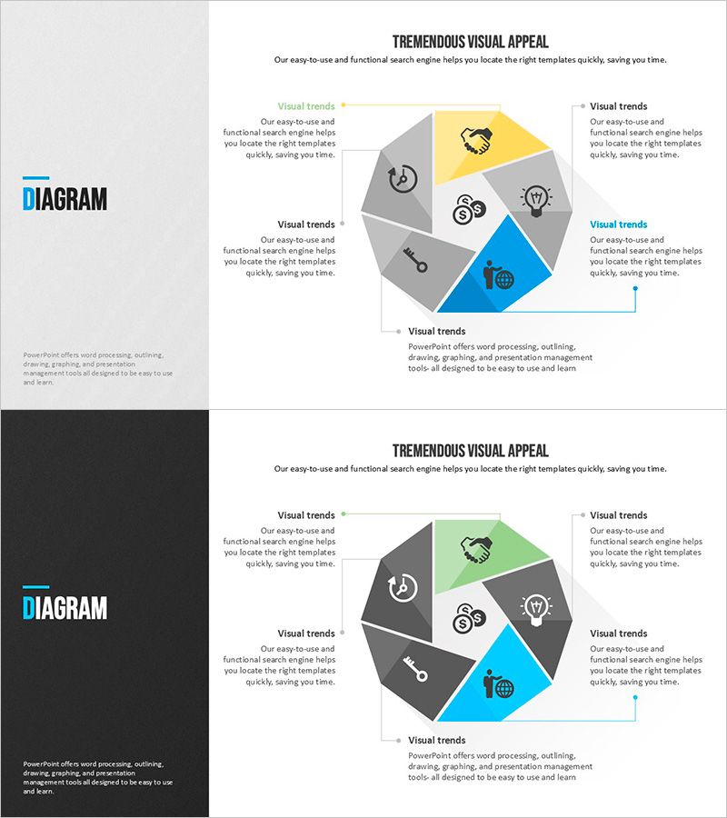
A 6-section cluster diagram PowerPoint slide that visually represents service composition elements. The structure radiates from a central core concept to six surrounding segments, each with space for icons and text. Designed with gray, yellow, and blue tones to create clear visual hierarchy, this slide effectively explains service functions, organizational structures, and process stages in business presentations. The 2-slide set includes both light and dark background versions, ready for immediate editing and customization in your presentation deck.
Usage Points
-
Main Usage
Visualize service components, organizational departments, business functions, or process stages using a radial structure that expands from a central concept to six surrounding elements. Edit the icons and text in each section to effectively communicate key content in company profiles, proposals, and business plans.
-
How to Use
Enter your core concept (service name, organization name, or project title) in the central circle. Add item names and descriptions to each of the six segments. Replace default icons with your brand icons and adjust colors to match your presentation theme and corporate identity.
-
Recommended For
Marketing professionals explaining service features, executives introducing organizational structure, project managers presenting six strategic elements, and teams preparing startup pitches, corporate presentations, and internal training materials. Ideal for business development and stakeholder communication.
-
Slide Structure
2-slide set. Each slide features one central circular node with six surrounding segments, each containing icon and text input areas. First slide has light background; second slide features dark background for flexible design options.
Related Products
-

Circular Connection Diagram – Operations Plan and Service Execution
#Operational Plan #Technical Approach #Diagram
-

Technical Aspects of the Performance – Immersive Experience Through Lighting and Sound
#Technical Approach #Diagram #Service Components
-

AI-Based Data Analytics System for Health Fitness Experts
#Technical Approach #Diagram #Other
-

Diffusion Diagram of the Facility System
#Technical Approach #Diagram #Service Components
