Layout Design Presentation Template - Column Charts
RJ0200029_21
- Last Update 04/05/2025
- File Size 0.1MB
- # of Slides 2
- File Format PPTX
- Slide Ratio 16:9
- Color
Keywords
About the Product
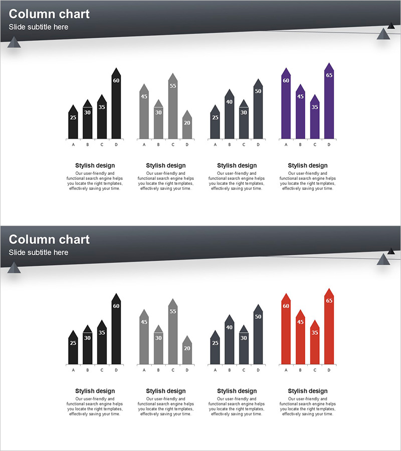
A vertical column chart PowerPoint slide designed to compare and analyze data across four distinct series using color-coded bars. Each series is represented in black, gray, dark gray, and purple tones, with numerical values displayed above each column for precise data communication. This 2-slide template is ideal for market analysis, competitive benchmarking, sales performance comparison, and departmental KPI reviews. Optimized for 16:9 widescreen format and fully editable in PPTX, allowing seamless integration into business presentations, financial reports, and strategic planning decks.
Usage Points
-
Main Usage
Visualizes multiple numerical data points using vertical bar heights to enable quick comparison and analysis. The four color-coded series allow simultaneous representation of different metrics for the same categories, such as quarterly sales figures, competitor market share, or departmental performance against targets.
-
How to Use
Replace the numerical values above each column with your own data and update category labels (A, B, C, D) as needed. Colors can be retained or customized through PowerPoint's shape formatting options. Duplicate the slides to create additional data visualizations or combine multiple chart types within a single presentation.
-
Recommended For
Financial reports showing sales trends, marketing presentations with market research findings, business plans with competitive analysis, quarterly performance reviews, and departmental KPI comparisons. Particularly effective when presenting four or more comparative data points that require clear visual differentiation.
-
Slide Structure
Two-slide template, each containing one vertical column chart with four data series. Numerical labels appear above each column for clarity. The first slide features black, gray, dark gray, and purple series; the second uses black, gray, dark gray, and red. Both slides include a text area at the bottom for adding descriptive content or annotations.
Related Products
-

Market Competitor Analysis with Clustered Vertical Bar Chart
#Market and Competitor Analysis #Graph #Competitor Analysis
-

Vertical Bar Chart for Future Growth Prediction – Innovative Vision
#Market and Competitor Analysis #Graph #Competitor Analysis
-

Vertical Bar Chart Slide for Effective Data Visualization
#Market and Competitor Analysis #Graph #Competitor Analysis
-

Competitor Brand Product Comparison Analysis Graph
#Market and Competitor Analysis #Graph #Competitor Analysis
