3D Pie Chart Comparison for Key Metrics – Powerful Data Delivery through Visualization
RB0800029-1_13
- Last Update 03/24/2025
- File Size 0.4MB
- # of Slides 2
- File Format PPTX
- Slide Ratio 4:3
- Color
Keywords
About the Product
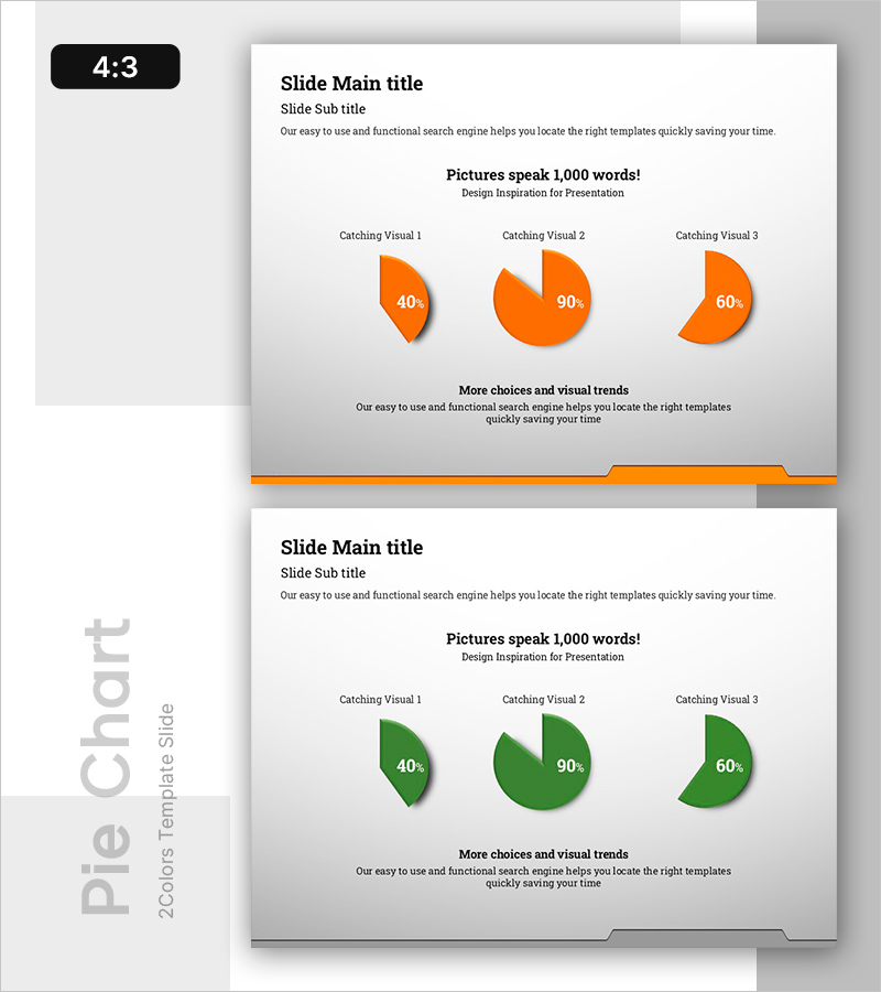
A PowerPoint slide featuring dual pie charts for comparing key metrics and data ratios. The design presents identical three-segment structures in orange and green colors, with proportions of 40%, 90%, and 60% respectively. Each chart includes 3D shadow effects for visual depth and emphasis. This 2-slide PPTX template in 4:3 aspect ratio is fully editable and ready for immediate use. Perfect for business presentations, marketing analysis, financial reports, and performance comparisons where visual contrast and ratio data need clear communication.
Usage Points
-
Main Usage
Display and compare proportional data across two scenarios, time periods, or categories using dual pie charts. The contrasting color scheme (orange vs. green) emphasizes differences and facilitates audience comprehension of ratio-based metrics. Suitable for market share analysis, budget allocation, customer segmentation, and performance benchmarking.
-
How to Use
Replace the 40%, 90%, and 60% values with your actual data. Use the orange chart for current state or baseline metrics, and the green chart for target goals or competitor comparison. Add custom labels and legends to clarify each segment's meaning. The 3D effect and shadow styling enhance visual impact during presentations.
-
Recommended For
Marketing professionals, financial analysts, business executives, management consultants, and sales presenters. Ideal for quarterly performance reviews, budget distribution reports, customer demographic analysis, market penetration comparisons, and strategic planning presentations.
-
Slide Structure
2-slide template. Each slide contains one 3-segment pie chart with identical proportions. Slide 1 features orange coloring (40%, 90%, 60%); Slide 2 uses green coloring with matching segments. 3D depth effects and drop shadows enhance visual prominence. Title area at top; descriptive text area at bottom for context and annotations.
Related Products
-

Modern Blue Presentation Doughnut Chart 2 – Visualizing Business and Investment Performance
#Business Strategy #Financial Plans and Performance #Graph
-

User Analysis Graph by Age Group – Advanced Data Insights
#Market and Competitor Analysis #Diagram #Graph
-

Astronomy Research Topic Positioning – Insightful Market Analysis
#Market and Competitor Analysis #Marketing Plan and Strategy #Diagram
-

Analysis of Smart Network Systems – Data Visualization for Innovation
#Product/Service Introduction #Diagram #Graph
