Free Line Chart Template to Visualize Data Changes
RB0800028-1_15
- Last Update 03/23/2025
- File Size 0.3MB
- # of Slides 2
- File Format PPTX
- Slide Ratio 4:3
- Color
Keywords
About the Product
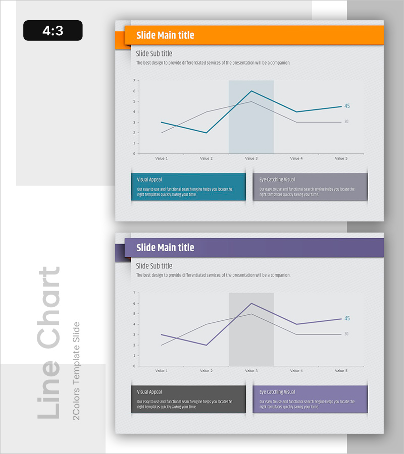
A free line chart slide that clearly visualizes data changes over time with two comparable data series. Simply replace the text and values in PowerPoint to instantly use this presentation slide in business plans, reports, and proposals. The chart supports dual-axis comparison, making it ideal for expressing sales trends, performance metrics, and customer growth. Download for free and edit with ease—no design skills required. Explore more graph and diagram slide collections at GoodPello.
Usage Points
-
Main Usage
Visualizes changes in two data series over time, enabling clear comparison of trends. Ideal for expressing sales forecasts, performance metrics, market trends, customer growth, and other time-based data comparisons in presentations.
-
How to Use
Replace the title and subtitle with your presentation topic. Update the Value 1-5 labels and the 30/45 data points with your actual figures. Modify the two description boxes at the bottom with key insights from your data.
-
Recommended For
Perfect for business plans (sales projections), quarterly/annual reports, marketing plans (campaign performance), investor pitches (growth trajectories), and proposals (improvement outcomes).
-
Slide Structure
Single-slide layout with header section (title and subtitle), central line chart with dual-series comparison, and two descriptive text boxes below. The chart displays five data points with optional highlight area to emphasize specific periods.


