Data Presentation Visualized with Bar Graphs – Emphasizing Achievements
RB0800016_5
- Last Update 03/21/2025
- File Size 2.7MB
- # of Slides 2
- File Format PPTX
- Slide Ratio 4:3
Keywords
About the Product
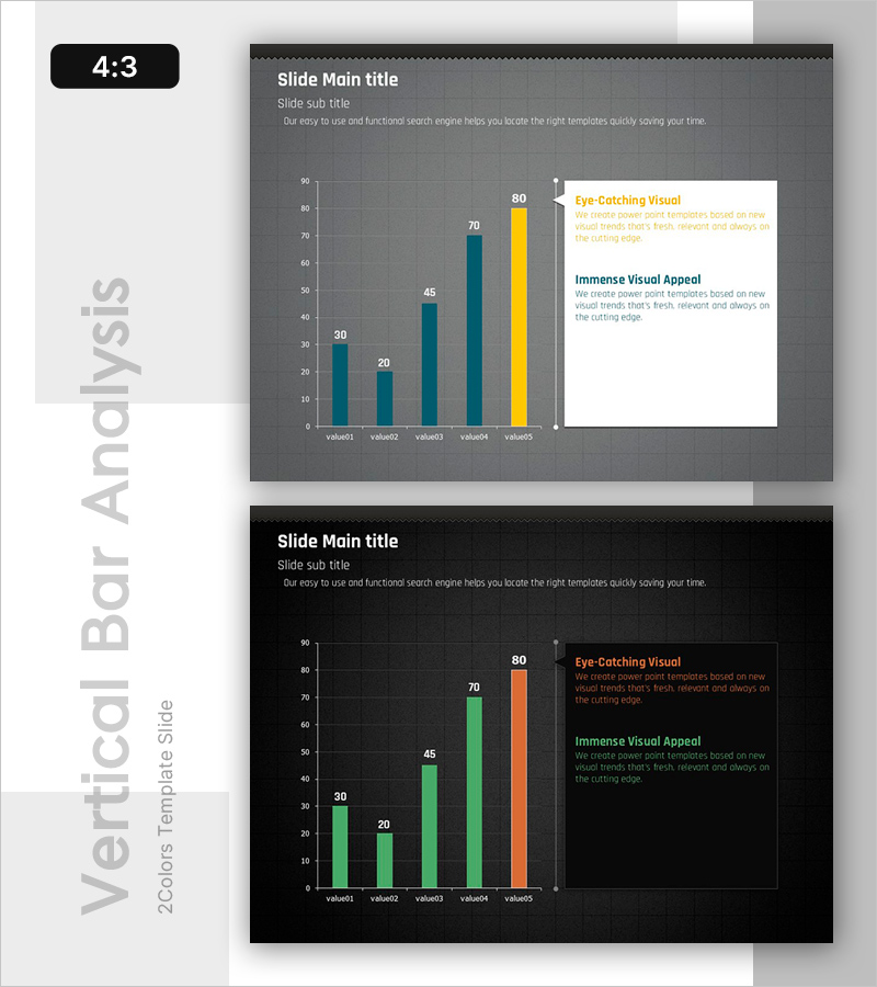
A PowerPoint slide that visualizes quantitative data using a horizontal bar chart with five values. The design features a dark gray background with teal and yellow bar colors, creating strong visual contrast for data emphasis and readability. The layout divides the slide into a left chart area and right text box, making it ideal for presenting performance metrics, market analysis, financial indicators, and comparative data. Supplied in 4:3 ratio PPTX format, fully editable and ready to integrate into business presentations, investor pitches, and executive reports.
Usage Points
-
Main Usage
Presents quantitative data through horizontal bar comparison, enabling clear visualization of performance metrics, market share, financial figures, and competitive analysis. The right-side text box reinforces data interpretation with key insights and conclusions.
-
How to Use
Replace chart values and labels with your actual data. Add analysis findings or key messages in the right text box. Customize colors to match your brand identity. Use in investor presentations, executive dashboards, quarterly reports, and market analysis documents.
-
Recommended For
Finance teams presenting quarterly results, marketing teams analyzing market trends, executives making data-driven decisions, competitive benchmarking reports, and performance review presentations. Suitable for both internal and external stakeholder communication.
-
Slide Structure
Two-slide set with dark gray and black background variations. Each slide features a left-aligned horizontal bar chart displaying five comparable values, paired with a right-side text box containing title, subtitle, and two descriptive text areas for data context and interpretation.
Related Products
-

Product Roadmap PowerPoint Slide – Q1 to Q4 Launch Matrix
#Product/Service Introduction #Business Strategy #Development Plan
-

AI Efficiency Value PowerPoint Slide – 4-Bubble KPI Layout
#Company Introduction #Business Vision and Strategy #Business Strategy
-

Brand vs. Competitor Messaging Slide – 3-Point, Blue & Green
#Product/Service Introduction #Market and Competitor Analysis #Benefits and Advantages
-

Campaign Goals & Funnel Outcomes Slide – Blue & Green
#Business Strategy #Marketing Plan and Strategy #Diagram
