Detailed Graph of Fund Management Analysis – Emphasis on Financial Performance
RM0600004_23
- Last Update 02/24/2025
- File Size 0.3MB
- # of Slides 2
- File Format PPTX
- Slide Ratio 16:9
- Color
Keywords
- #Content-Based Slides
- #Design-Based Slides
- #Marketing Plan and Strategy
- #Financial Plans and Performance
- #Diagram
- #Graph
- #Pricing Strategy
- #Capital Requirements
- #Table
- #Horizontal Bar
- #Segmented Horizontal Bar
- #16:9
- #segmented bar chart PowerPoint
- #stacked bar graph presentation
- #fund management analysis slide
- #financial performance chart
- #asset liability comparison
- #PowerPoint chart template download
About the Product
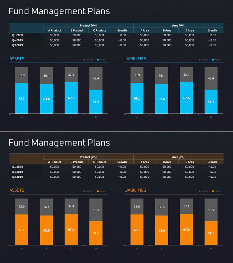
A segmented stacked bar chart PowerPoint slide designed to compare and analyze fund management plans and financial performance. Set against a dark background with blue and gray color schemes, this chart breaks down assets and liabilities across four data series by product (A, B, C, D Product). Quarterly data (Q1 2020, Q4 2019, Q3 2019) can be compared at a glance with clearly labeled numerical values. Perfect for financial reports, investor presentations, fund performance updates, and quarterly reviews. Includes 2 slides in 16:9 widescreen format.
Usage Points
-
Main Usage
Compare fund management plans against actual performance using multi-series data visualization, and clearly present asset and liability composition. Simultaneously communicate quarterly trends and product-specific performance to emphasize financial transparency and accountability.
-
How to Use
Use in fund performance reports, investor relations presentations (IR), financial results announcements, and asset management status updates to explain quarterly and product-level fund flows. Edit the numerical values directly to input actual data and immediately deploy as presentation material.
-
Recommended For
Fund managers, financial officers, investment analysts, CFOs, and asset management company professionals preparing quarterly reports, shareholder meeting materials, and client presentation decks. Particularly suitable for financial services, insurance, and asset management industry presentations.
-
Slide Structure
2-slide set with consistent layout. Each slide features a title and data table (quarters, products, growth rates) at the top, with a stacked bar chart for ASSETS (left) and LIABILITIES (right) positioned symmetrically below. Four color series (gray, blue, light blue, dark gray) distinguish each data category, with numerical labels displayed on each segment for precise data reading.
Related Products
-

Fund Management Plan Table Slide – Financial Planning and Performance
#Marketing Plan and Strategy #Financial Plans and Performance #Diagram
-

Fund Management Plan – A New Vision for Finance
#Marketing Plan and Strategy #Financial Plans and Performance #Diagram
-

Fund Management Calculation Table – Visualizing Financial Plans
#Marketing Plan and Strategy #Financial Plans and Performance #Diagram
-

Funding Plan Table – Efficient Fund Management
#Marketing Plan and Strategy #Financial Plans and Performance #Diagram
