Key Customer Comparison Analysis Slide – Client Success Stories and Data Visualization
RM0300012_18
- Last Update 02/10/2025
- File Size 0.6MB
- # of Slides 2
- File Format PPTX
- Slide Ratio 16:9
- Color
Keywords
- #Content-Based Slides
- #Design-Based Slides
- #Customer Success Stories
- #Diagram
- #Graph
- #Introduction of Key Customers
- #Cluster
- #Horizontal Bar
- #Closed Cluster Diagram
- #Horizontal Bar Chart
- #16:9
- #horizontal bar chart PowerPoint
- #vertical bar chart slide template
- #customer comparison analysis slide
- #data visualization PowerPoint
- #bar graph presentation template download
About the Product
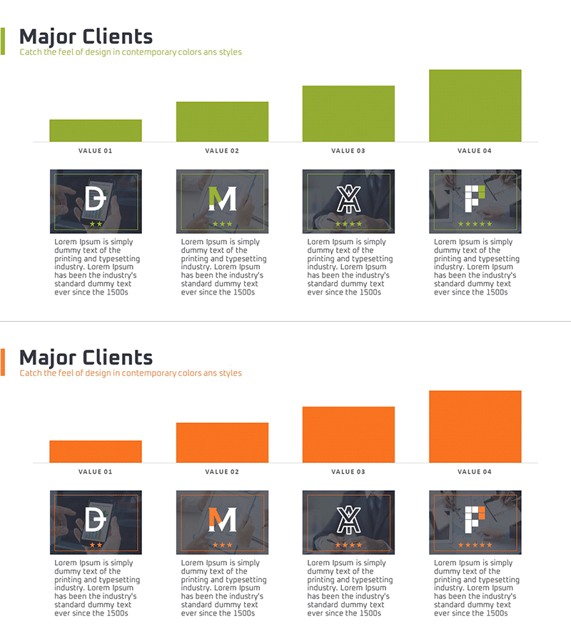
A 2-slide PowerPoint presentation designed to visually compare and analyze key customer performance metrics. Features both horizontal and vertical bar charts, enabling flexible data representation across different analytical contexts. The slides are color-coded in lime green and orange to clearly distinguish customer success stories and performance data. Each slide accommodates four customer entries with editable data fields, making it ideal for presentations and business reports that require immediate deployment.
Usage Points
-
Main Usage
Effectively communicate key customer performance indicators, revenue figures, satisfaction scores, and growth rates through comparative analysis. Horizontal bars excel at side-by-side item comparison, while vertical bars are optimized for time-series trend visualization, accommodating diverse data narratives.
-
How to Use
Integrate into company profile presentations under the customer success section, business performance reports, and investor pitch decks to demonstrate customer portfolio strength and business reliability. Adjust bar lengths to reflect actual data, modify axis labels and legends to align with presentation context, and customize customer names and metrics as needed.
-
Recommended For
Sales and marketing professionals presenting customer portfolios, executives reporting business performance, and investors evaluating customer base stability. Ideal for B2B companies showcasing client success stories, consulting firms analyzing project outcomes, and service providers comparing customer satisfaction metrics.
-
Slide Structure
Slide 1: Lime green background with horizontal bar chart comparing four customers across key metrics. Slide 2: Orange background with vertical bar chart displaying multi-series data (e.g., quarterly revenue, growth rates) for the same customers. Both slides feature editable text fields and shapes for customer names, values, and legends.
Related Products
-

Data-driven Trend Analysis PowerPoint Template - Market Insights
#Market and Competitor Analysis #Diagram #Graph
-

Perfect Team Personnel Profile – Slide for Major Client Introduction
#Company Introduction #Customer Success Stories #Diagram
-

Horizontal Bar Chart for Professional Team Human Resources Analysis
#Company Introduction #Market and Competitor Analysis #Diagram
-

Graph Slide for User Data Analysis – Visual Trends and Appeal
#Company Introduction #Market and Competitor Analysis #Diagram
