Data-Driven Value Proposition PowerPoint Slide
RJ0600111_4
- Last Update 01/26/2026
- File Size 15.4MB
- # of Slides 2
- File Format PPTX
- Slide Ratio 16:9
- Color
Keywords
About the Product
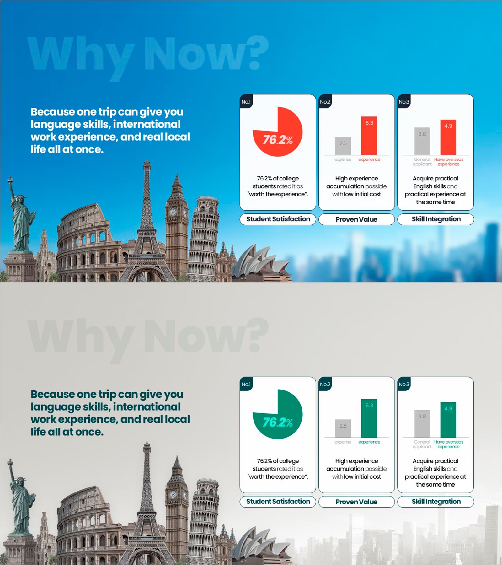
A 2-slide PowerPoint presentation that quantifies the value of global experience through data visualization. The first slide features a 76.2% pie chart highlighting student satisfaction, while the second slide uses gray and red bar graphs to compare experience accumulation and practical skill acquisition. Set against a blue background with white typography, this slide deck builds credibility for educational services, study abroad programs, and language immersion initiatives. Delivered in 16:9 widescreen PPTX format for seamless compatibility across all presentation environments.
Usage Points
-
Main Usage
Quantify the value of educational services, study abroad programs, and language immersion through data-driven market analysis. The 76.2% pie chart emphasizes student satisfaction, while comparative bar graphs illustrate the superiority of experience accumulation and practical skill development, making it highly effective for persuading decision-makers, parents, and investors.
-
How to Use
Deploy in educational institution program briefings, university admissions presentations, and investment pitches within the value proposition section. The first slide establishes student satisfaction statistics, while the second demonstrates competitive advantages in experience and skill acquisition, building audience confidence and motivating program selection.
-
Recommended For
Educational marketing teams, study abroad agencies, language immersion centers, university admissions departments, and education consultants presenting program value. Ideal for parent, student, investor, and partner presentations where data-backed credibility and competitive differentiation are essential.
-
Slide Structure
Two-slide layout with the first slide containing a title area, 76.2% pie chart, and three-line descriptive text. The second slide includes a title area, three-item comparative bar graphs in gray and red, and supporting text for each metric. Unified blue background and white typography ensure consistent, professional data visualization throughout.
Related Products
-

Diagram for Sustainable Market Size Analysis & Competitor Insights
#Market and Competitor Analysis #Diagram #Market Status
-

Business Status Chart – Presentation Template for Market Analysis
#Market and Competitor Analysis #Diagram #Graph
-

Strategic Market Analysis Bar Chart
#Market and Competitor Analysis #Graph #Market Status
-

Visual Insights on Education Analysis PowerPoint
#Market and Competitor Analysis #Diagram #Graph
