Table Chart Comparison Slide – Visualizing Financial Performance
RJ0500019_10
- Last Update 08/27/2025
- File Size 0.5MB
- # of Slides 2
- File Format PPTX
- Slide Ratio 16:9
- Color
Keywords
About the Product
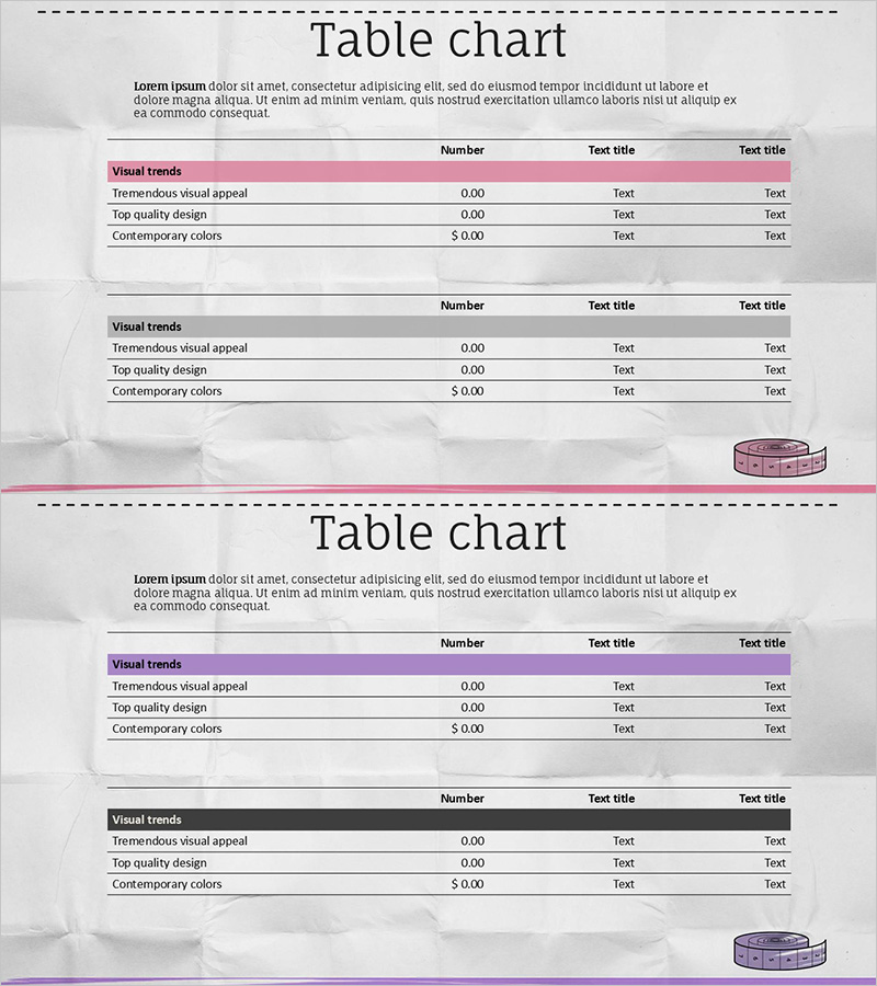
A table chart PowerPoint slide designed for financial performance and budget comparison presentations. This 2-slide set features pink and blue header color variations, with each slide containing a 3-column (Number, Test title, Test title) and 4-row structure for clear numerical data alignment. Ideal for company performance analysis, financial metrics comparison, and budget status reporting. The layout combines background imagery with optimized data readability, making it ready for immediate use in professional presentations.
Usage Points
-
Main Usage
Visualizes numerical data such as financial metrics, budget status, and performance comparisons in a structured table format. The aligned row-and-column structure enables simultaneous comparison of multiple data points, with header colors emphasizing information hierarchy.
-
How to Use
Apply in financial reports, business performance presentations, investor briefings, and budget planning meetings. Data can be easily entered via copy-paste functionality, and color variations (pink/blue) allow selection based on presentation tone and corporate branding.
-
Recommended For
Recommended for finance teams, executives, consultants, and analysts supporting data-driven decision-making. Particularly effective for quarterly performance reviews, budget allocation meetings, and investor-facing presentations requiring data credibility.
-
Slide Structure
Each slide includes a title area, descriptive text section, and a 3-column by 4-row table. The header row is highlighted in pink or blue for emphasis, while data rows use white backgrounds for optimal readability. Both slides maintain identical structure with color variation only, ensuring consistent presentation flow.
Related Products
-

Marketing Budget Allocation Table – Effective Budget Planning
#Financial Plans and Performance #Diagram #Income Statement
-

Network Development Budget and Profit and Loss Statement – Financial Planning Visualization
#Financial Plans and Performance #Diagram #Income Statement
-

Navy Red Table Slide – Clearly Visualizing Financial Performance
#Financial Plans and Performance #Diagram #Income Statement
-

Annual Marketing Budget Analysis Chart - Visualizing Financial Performance
#Financial Plans and Performance #Diagram #Graph
