Blue Pink Table Chart – The Appeal of Data Visualization
RJ0900024_25
- Last Update 08/23/2025
- File Size 4.9MB
- # of Slides 2
- File Format PPTX
- Slide Ratio 16:9
- Color
Keywords
About the Product
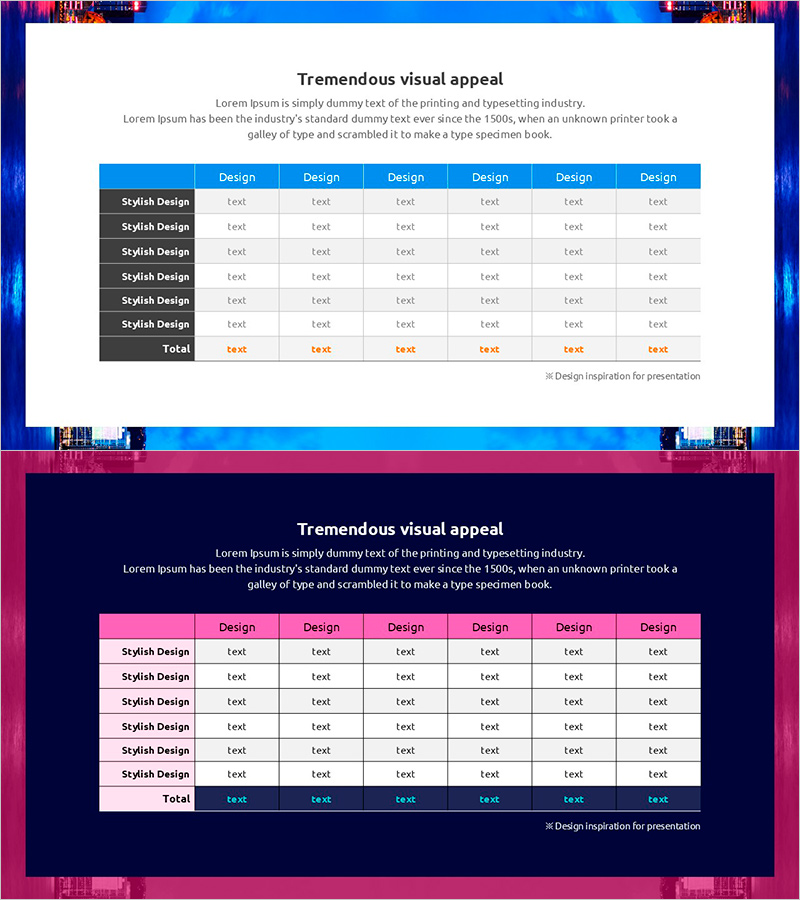
A 6-column table diagram PowerPoint slide featuring blue and pink two-tone color scheme for professional data visualization. The header row uses bright blue background with white text for strong visual emphasis, while data rows alternate between gray and white backgrounds to enhance readability. The Total row at the bottom is highlighted in orange text to distinguish key metrics. This PowerPoint slide template is ready to use for business reports, analytical presentations, performance reviews, and comparative analysis. Designed in 16:9 widescreen format for modern presentation environments.
Usage Points
-
Main Usage
Optimized for comparing and analyzing multiple data points organized in rows and columns. Ideal for product performance comparison, sales analysis, departmental results summary, customer satisfaction surveys, and other quantitative information that requires systematic presentation.
-
How to Use
Replace 'Design' headers with your category names and update 'text' placeholders with actual data values. The blue-pink color scheme is pre-applied, allowing immediate insertion into presentations without additional design work. Easily adjust row count to match your data volume.
-
Recommended For
Financial analysts, marketing managers, project managers, consultants, and educators who need to present data-driven insights. Suitable for quarterly performance reports, competitive analysis, customer segmentation, budget allocation, and other business scenarios requiring structured data presentation.
-
Slide Structure
Two-slide set with contrasting backgrounds: first slide features white background with blue header and alternating gray-white data rows; second slide uses dark navy background with pink header and alternating white-gray data rows. Each slide contains 6 columns and 6 data rows plus 1 Total row, accommodating up to 42 data points per slide.
Related Products
-

The Road Template Diffusion Diagram – Product and Service Differentiation Strategy
#Product/Service Introduction #Business Vision and Strategy #Diagram
-

Business Forest Wide Template Diagram2 – Flowchart for Market Strategy
#Marketing Plan and Strategy #Diagram #Target Market Strategy
-

F&B Menu PowerPoint Slide – Circular 4-Step Process Layout
#Operational Plan #Diagram #Business Processes
-

BUSINESS PLAN presentation template PUZZLE DIAGRAM1
#Business Vision and Strategy #Diagram #Business Strategy
