Visualizing Target Performance Figures – Emphasizing Key Achievements and Visual Appeal
RJ0900011_10
- Last Update 08/18/2025
- File Size 0.3MB
- # of Slides 2
- File Format PPTX
- Slide Ratio 16:9
- Color
Keywords
- #Content-Based Slides
- #Design-Based Slides
- #Company Introduction
- #Business Strategy
- #Diagram
- #Key Achievements
- #Achievements
- #Cluster
- #Chain Diagram
- #16:9
- #connected diagram PowerPoint
- #3-node circular diagram slide template
- #performance metrics visualization
- #data comparison diagram PPT
- #business presentation diagram template
About the Product
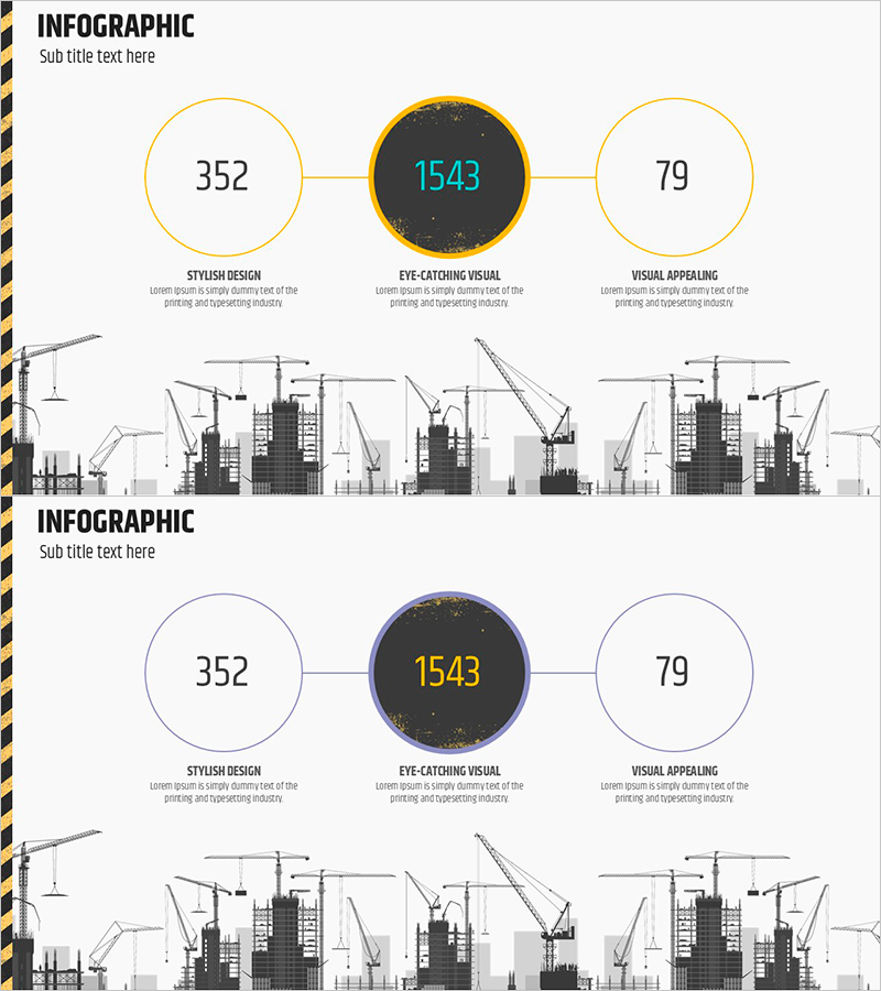
A PowerPoint slide template that visualizes target achievement and key performance indicators using three circular nodes connected by horizontal lines. The central dark-gray emphasized node displays the primary metric, while left and right nodes present supporting indicators, creating a clear data hierarchy. Gold borders and connecting lines highlight relationships between nodes, while the construction site silhouette illustration at the bottom symbolically conveys project progress. The 2-slide set offers multiple color combinations (gold, blue, gray) for customization to match corporate branding. Ready-to-use for business presentations, performance reports, and quarterly achievement analysis.
Usage Points
-
Main Usage
Designed to display corporate key performance indicators (KPIs), goal achievement rates, and business outcomes by categorizing them into three primary metrics for at-a-glance comparison. The hierarchical data structure—with the most critical figure in the central node and supporting metrics in flanking nodes—makes it ideal for executive briefings, investor presentations, and quarterly performance announcements.
-
How to Use
Replace the numbers and text within each circular node with actual performance figures and metric labels. Select the color combination (gold, blue, or gray) that matches your corporate brand identity, then adjust node background colors, border thickness, and font sizes to control emphasis. The construction site illustration at the bottom can be swapped with industry-specific background imagery to reinforce your sector's visual identity.
-
Recommended For
Ideal for executives, CFOs, business unit leaders, project managers, and marketing professionals presenting quarterly or annual performance summaries. Particularly effective when comparing three key metrics simultaneously—such as revenue, profit, and customer satisfaction, or goal achievement rate, cost reduction, and quality improvement. Frequently used in official presentations across finance, construction, manufacturing, and consulting sectors.
-
Slide Structure
Slide 1: Three circular nodes with gold borders (left 352, center 1543, right 79) connected by horizontal lines, with construction site silhouette at bottom. Slide 2: Identical layout with blue border version. Each node is independently editable; text labels (STYLISH DESIGN, EYE-CATCHING VISUAL, VISUAL APPEALING) can be replaced with actual metric names.
Related Products
-

Visual Slide for Pet Store Growth Achievements
#Company Introduction #Business Strategy #Diagram
-

Circular Graph by Instrument – Performance and Strategy
#Company Introduction #Business Strategy #Graph
-

Annual Awards Introduction Slide – Showcase Key Achievements at a Glance
#Company Introduction #Diagram #Awards and Certifications, and Patents
-

Market Overview and Growth Trend – Strategic Data Analysis
#Business Strategy #Market and Competitor Analysis #Diagram
