Regional Analysis Bar Graph – Market Trends and Competitive Analysis
RJ0900010_26
- Last Update 08/18/2025
- File Size 0.5MB
- # of Slides 2
- File Format PPTX
- Slide Ratio 16:9
- Color
Keywords
About the Product
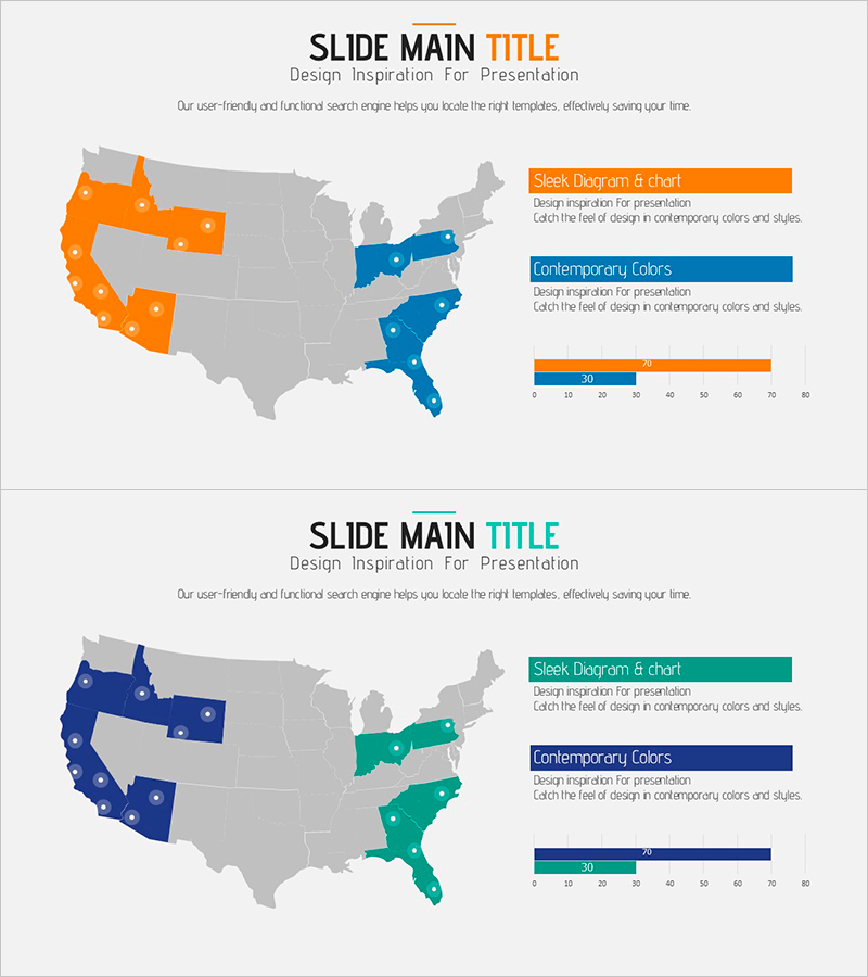
A PowerPoint slide that compares regional market conditions across the United States using orange and blue color coding. The map highlights key regions while the legend and bar graph on the right provide clear visualization of market trends and competitive analysis data. This 2-slide set offers different color combinations to adapt to various presentation scenarios, optimized for 16:9 widescreen format. Delivered in fully editable PPTX format, allowing you to quickly input your own data and customize the design.
Usage Points
-
Main Usage
Visualizes regional market conditions, competitor distribution, and market share across geographic areas. The combination of color-highlighted map, legend, and bar graph enables stakeholders to understand complex regional data at a glance.
-
How to Use
Ideal for business plans, market analysis reports, and investor pitch decks in the market overview section. Customize the map colors to match your data, then update the legend and bar graph values to reflect your specific metrics.
-
Recommended For
Marketing managers, business development teams, executives preparing reports, market research analysts, and strategy planners who need to present regional market strategies or support decision-making with geographic data.
-
Slide Structure
Two-slide set with different color combinations—first slide features orange and blue, second slide offers alternative colors. Each slide contains three functional areas: left side map region (geographic highlighting), upper right legend (color explanation), and lower right bar graph (numerical data display).
Related Products
-

Business Forest Wide Template Europe Map – A New Horizon for Market Analysis
#Market and Competitor Analysis #Financial Plans and Performance #Diagram
-

Business Plan Presentation Template - World Wide Map
#Market and Competitor Analysis #Financial Plans and Performance #Graph
-

Proportional Graph by Meat Part – Market Analysis Insights
#Market and Competitor Analysis #Diagram #Graph
-

Bundled Graphs and Maps for Business Plan Visualization
#Market and Competitor Analysis #Graph #Other
