Simple Highlight Table Chart – Diagram Design
RJ0900002_20
- Last Update 08/16/2025
- File Size 0.1MB
- # of Slides 2
- File Format PPTX
- Slide Ratio 16:9
- Color
Keywords
About the Product
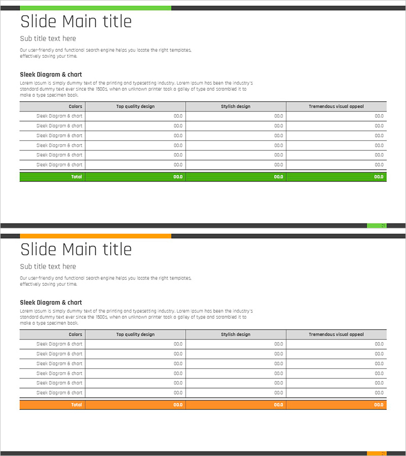
A professional 6-row highlight table chart PowerPoint slide designed for business presentations and data comparison. This diagram features a dual-tone color scheme with green and orange accents, organizing evaluation metrics across four columns: Colors, Top Quality Design, Stylish Design, and Tremendous Visual Appeal. Each row is clearly separated for easy data entry, with a highlighted total row at the bottom to emphasize key figures. The 2-slide PPTX template in 16:9 format is fully editable and ready for immediate use in business reports, marketing plans, performance analysis presentations, and executive briefings.
Usage Points
-
Main Usage
Organize quantitative metrics and evaluation criteria in a matrix format for clear comparative analysis. The color-coded row highlighting enables visual distinction of important items, while the total row summarizes overall results at a glance.
-
How to Use
Apply to performance evaluation sections in business reports, channel performance comparisons in marketing plans, feature comparison tables in proposals, financial metric analysis in investor pitches, and quarterly review presentations. Simply input your data into each cell for immediate presentation-ready output.
-
Recommended For
Finance, planning, marketing, and sales professionals preparing regular reports, executive performance briefings, client proposal presentations, and team performance review meetings. Ideal for any business scenario requiring data-driven decision-making and comparative analysis.
-
Slide Structure
2-slide template with 6-row × 4-column table structure per slide. Header row displays column titles (Colors, Top Quality Design, Stylish Design, Tremendous Visual Appeal), six data entry rows in the middle, and a highlighted total row at the bottom. Green header and orange total row provide visual hierarchy and emphasis.
Related Products
-

Idea Presentation Diagram – Business Execution and Strategic Vision
#Business Strategy #Operational Plan #Marketing Plan and Strategy
-

The Road Template Diffusion Diagram – Product and Service Differentiation Strategy
#Product/Service Introduction #Business Vision and Strategy #Diagram
-

Presentation Template for Business Strategy Using Arrow Diagram
#Business Strategy #Operational Plan #Diagram
-

BUSINESS PLAN presentation template PUZZLE DIAGRAM1
#Business Vision and Strategy #Diagram #Business Strategy
